Have you ever seen two sales page designs so similar in content and layout that you confused the products?
Me either.
Sales page design is 100% subjective and unique to each individual business and offer.
And while there’s not an exact formula to follow for sales page designs, there are a few key elements you want to be sure you include in yours to help increase conversions.
1. Infuse your branding throughout the sales page from beginning to end.

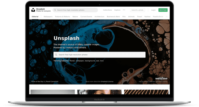
Your branding includes colors, shapes, fonts, and images that are both relevant and professional to the product you’re selling.
While stock images are readily available for almost any type of sales page if you’re able to hire a photographer for your own personal photoshoot, do it.
A professional photoshoot is worth every penny and the photos can be used across all of your promotional outlets.
2. Make it easy for potential customers to get in contact with you.
If a potential customer has questions they need answered or have trouble with their enrollment, you want to ensure they know how to get in touch with you.
One way to do this is by adding your contact information to your sales page. Another option would be to add a live chat option so you can answer questions on the spot to increase your website conversions.
The more prompt you are with pre-sale questions, the more confident potential customers will in your post-sale custom support.
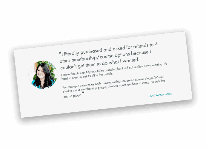
3. Testimonials create a lot of trust in your offering and build credibility, so use them wisely.
Using testimonials just for the sake of having testimonials is never a good idea, especially when you’re selling high-ticket items.
Be strategic about what trust-building elements you add. If the testimonials are vague, are not easy to read, or are otherwise overwhelming, they’re not going to provide the level of credibility they should, so make sure they are specific and presented in an organized, easy to read format.
You may also want to consider seeking endorsements from well-respected colleagues in your industry. Sometimes seeing a “celebrity entrepreneur” recommend you is all someone else needs to persuade them to buy.
Testimonials from past participants should help your soon-to-be customers understand the results they can expect to receive from your offer.


4. Don’t make it complicated for your potential customers to give you their money.
If it’s too difficult for your sales page visitors to easily enroll or sign up for your courses, you’re leaving money on the table.
Use a sticky or fixed navigation with a “Buy Now” button so your potential customers can enroll at any given time and ensure you’re using a reliable tech stack to make the sign up and checkout process as smooth as possible for your customers.
What the stats say:On average, sales pages convert at just 2.35%. To put that into perspective, only 2 people out of every 100 visitors to your sales page are going to follow through with a purchase. Don’t risk reducing that number by making it overly complicated for your potential customers to sign up.
5. Organization matters.
Use design elements that make your page flow and naturally lead your potential customers from one area to the next.
For example: if you decide to present your testimonials in a rotating slider, make sure the slider moves at a pace slow enough so the visitor can read the content in full before the next one appears.
If you don’t have a UX designer and talented copywriter on your team, do your best to put yourself in your customers’ shoes: the most important content should be shared early on in the page design so your offer is clearly communicated. Additional hesitations and clarifications can be addressed further down in the marketing copy.
Think about it: an FAQ section is valuable, but only after the website visitor understands exactly what you’re offering and how it could benefit them.


