If you’re reading this, it’s probably because you have an online course on your website and you can customize your landing page, also called a “sales page”.
A landing page is the heart and soul of any online course because it is the page that converts visitors into leads and customers. If you’ve been in the online space for a while, then you know that a landing page can make or break your online course.
Unfortunately, many creators neglect their online course landing page, even though they have spent weeks or months building the content for their course.
In this article, we’ll go over the elements of a great landing page, including content, design, navigation, and social proof, so you can create or update your sales page for better conversions.
The Importance of Having an Online Course Landing Page
A “Course Landing Page” is the entrance of any online course. It is a “no-distraction” page whose goal is to convert visitors into leads or customers.
When done right, a course landing page will convince visitors from an online marketing campaign to click the call-to-action button and complete a goal.
To turn visitors into leads or buyers for your course, the landing page needs to present specific information that encourages visitors to take action.
There are many entry points to your landing page, so knowing how people will arrive there will help you decide what information to include. Visitors might arrive from:
- A link on your website, blog post, or email
- Clicking an ad
- A referral from a friend
- A social media post
- Search engines
Your landing page should be able to address visitors from different sources, so those who are brand new to your work will be able to catch up with those who are already familiar.
Landing Page and Homepage Are Two Different Things
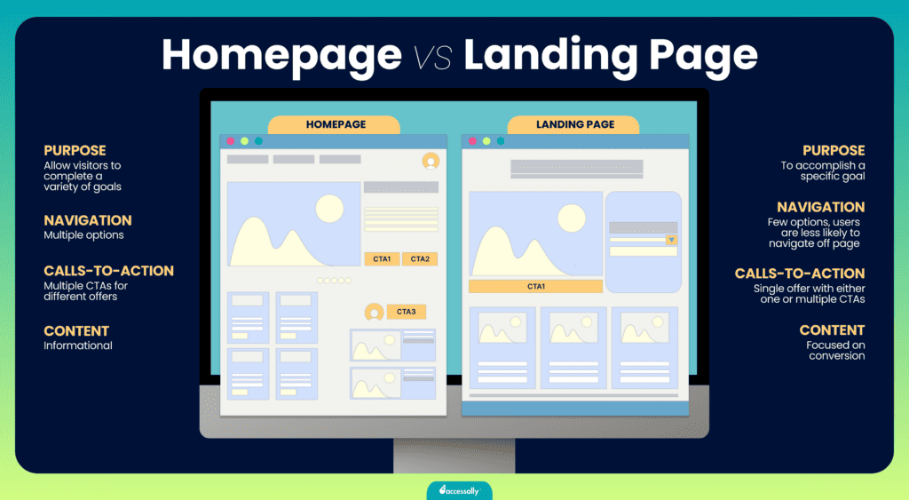
There are 4 differences between a homepage and a landing page:
- Multiple goals vs One goal: The goal of a homepage is to help visitors navigate the site through different pages. Meanwhile, a landing page has only one primary objective, which is to generate more leads or sales on THIS page and nowhere else.
- Multiple CTAs vs One CTA: A homepage has more links and therefore more distractions than a landing page, which offers a single call to action.
- Multiple vs Minimal distraction: A homepage’s goal is to introduce your business to the world, so it includes general information about the business and courses and offers several options as the next step on the user journey. Meanwhile, a landing page focuses on a single objective and has no distractions.
- Wider audience vs Target audience: A homepage’s audience is wider than the course landing page, which focuses on one specific course and goal. For example, you might offer several courses on yoga training, and you would mention all of them on the home page. On the other hand, the landing page only talks about one specific course such as prenatal yoga.

Keys to a High-Converting Online Course Landing Page
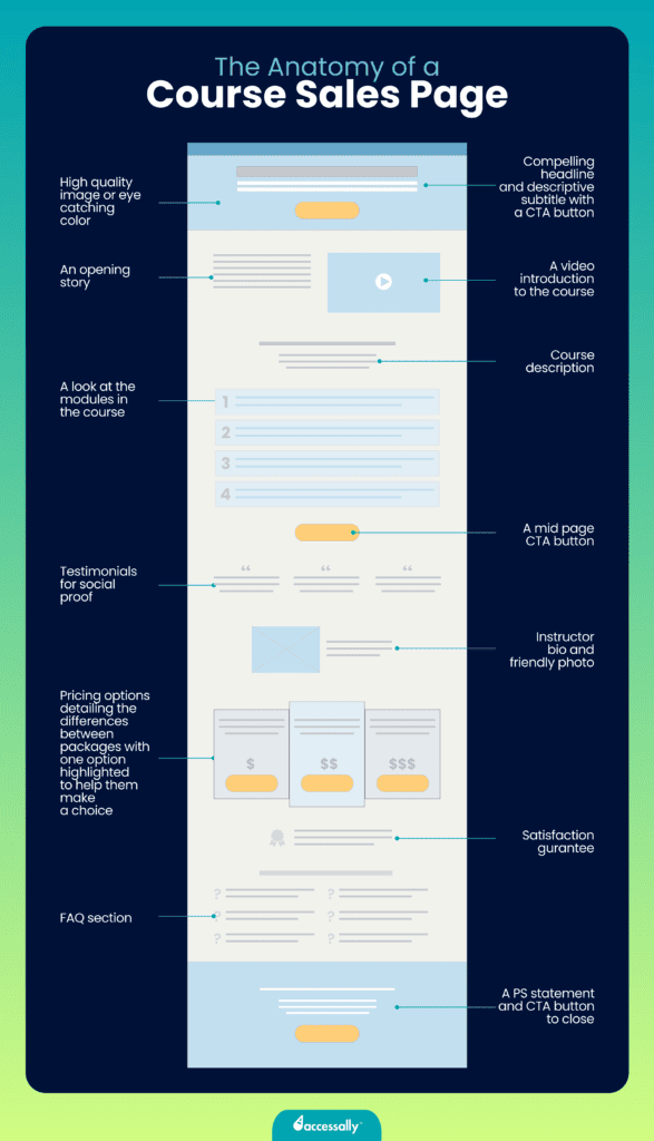
In this section, we’ll explore the anatomy of the perfect online course landing page to eliminate the guesswork.
When creating or updating your landing page, keep in mind that visitors aren’t looking to buy an online course. They are looking to solve a problem, achieve a result, and get a transformation in one area of their lives.

1- A headline that commands attention
The landing page headline should clearly communicate what your course is about. This is the first thing people will read and it should show the audience how they will benefit from your course.
Your headline should be a sentence that represents what transformation and benefit customers will get from the course. One mistake course creators make is to put the name of their course as the headline, but this isn’t descriptive enough.

Here are some tips to help you write an effective course sales page headline:
- Be specific: Now is not the time for language to try to appeal to everyone. Instead, you want to use the exact words that your course participants use to describe their problem or expected outcome. You have the rest of the landing page to go over more general information, but your headline should be focused on one core message.
- Refer to a key challenge: You want your headline to hook people’s attention and get them to keep reading. The best way to do that is to hone in on a key challenge that readers will resonate with. If your ideal course participant sees this line, they should immediately think “that’s for me” and relate to the challenge being highlighted.
- Use action words and phrases: Some words pack more of a punch. Leave the passive vague words out of your headline. Use a tool like OneLook or run an AI prompt on your headline to help you brainstorm stronger words. There’s a lot of power in using the word “you” and speaking directly to the reader of your landing page.
- Write many different headlines: You don’t want the first idea you jot down to be your final headline. The landing page headline determines if people will keep reading or not, so come up with different variations. You might end up testing different headlines once your landing page is published, to see which ones resonate better. Some copywriters recommend spending up to 80% of your time improving your primary headline.
✍🏻 Tip: You can run your headline through a scorecard to make sure you’re on the right track.
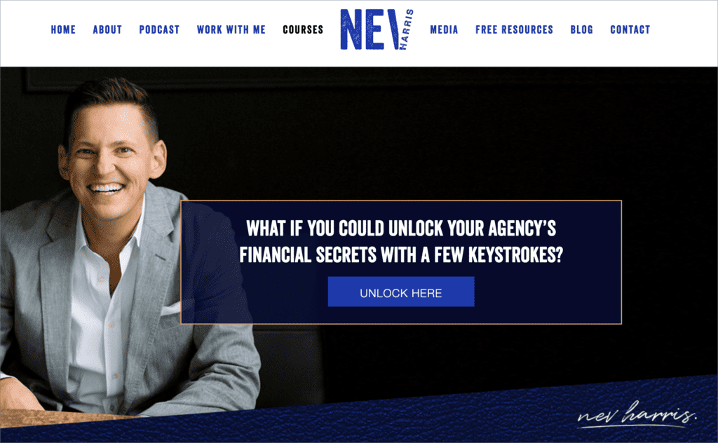

Here Nev Harris speaks to agency owners wanting to solve their financial stress.
2- A detailed course description
This is the section of your landing page that should come easy because it describes who the course is for, its benefits, and its outcomes. It’s also where you’ll list the contents of the course: lessons, workbooks, and other course materials.
The job of the course description isn’t just to list the course curriculum. This is the section of your landing page that will make your visitor feel understood and get them to keep reading after your headline piques their curiosity.
Here are some ways to make your course description truly connect with your readers:
- Be straightforward: Let the audience know who this course is for and who it is not for. Some courses are for beginners, and others are for advanced students. You may have clear course prerequisites, like a certain number of years of experience in a related field.
- Describe the expected outcome: One way to paint a clear picture for potential customers is to describe a before and after state. What might someone who hasn’t taken your course be experiencing right now, compared to a student who has completed your course. This before-and-after could be a real-life example from a past student, or it could be a hypothetical description.
- Use subheadings and sections: Some readers like to skim, so using subheadings to help them decide if they should read a section or skip it is key. This allows you to demonstrate how your course is structured, by showing different modules and lessons students can expect.
- Respond to the most likely objection a visitor may have: All of us are skeptical and as much as we want solutions for our problems, we wonder if a course will work for us. By addressing the objections that people have, you’re able to meet visitors where they are and help them make the best decision.
⏳ Note: Common objections include: how much time it will take a person to go through the course and get results, and whether results are typical.
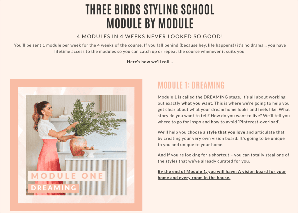

Here Three Bird Styling School describes each module of their course in detail.
3- Eye-catching CTAs (calls to action)
Conversions happen at several points throughout your landing page, through effective calls to action (CTAs).
Once visitors arrive on the landing page, these are the ‘action points’ that will direct them to do what you want them to do. Without powerful CTAs, visitors will leave before signing up for your course or lead magnet.
Plan the placement of your CTAs to ensure they guide your visitor through the buying process. Just like some people skim and others read every word, some people may be ready to take action sooner than others.
CTAs should be clearly worded, letting people know what you expect of them and what happens next.
Here are some tips to make your CTAs more effective:
- Make sure all of your CTA buttons lead to the same place: In most cases, your CTAs will start the checkout process for the course.
- Keep the CTA copy simple: Use action words and don’t overcomplicate the call-to-action button. Tried and true wording like “Buy Now”, “Enroll Now”, or “Sign Me Up” are all effective options to try.
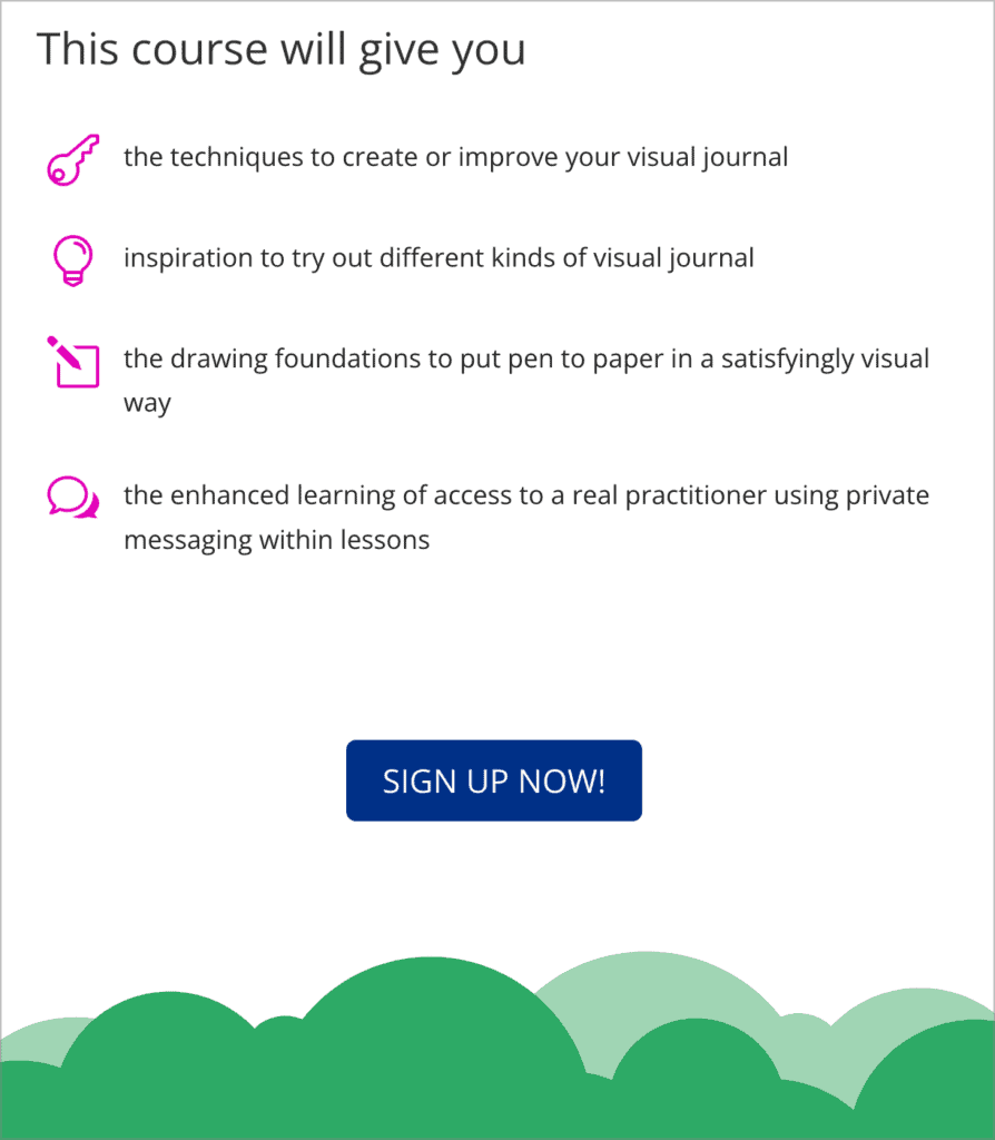

Here Graphic Change gives a recap of the benefits of the course followed by a sign up CTA.
4- Great visuals
Visuals and strong branding are essential to support your course description and keep your audience engaged. The design elements you choose will also help you stand out and give your course a professional feel that increases trust, and therefore conversions.
You can use images or screenshots from your online course to give people a visual of what they can expect after they purchase.
Videos work even better because a short course demo will keep visitors on your page longer.
Here are some tips to make your visuals work:
- Start with a header image that won’t distract from the headline and CTAs, but that will still grab the attention of a reader.
- Use mockups to help the audience visualize the journey through your course.
- Add charts, graphs, or diagrams to showcase results from the process you’re teaching.
- Use videos to give your page depth. This keeps visitors engaged and offers more information and context than a long piece of text would.
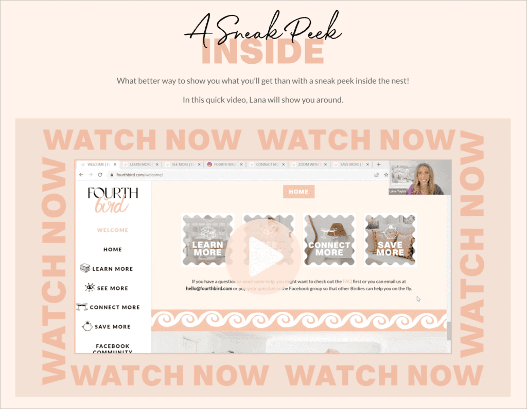

Here Fourth Bird includes a video walkthrough, along with other visual cues to keep you on the page.
5- Social proof
At this point in your landing page, readers have seen your headline and read your description and they know if they are interested in your course or not. That doesn’t mean they’ll automatically buy, even if they are interested.
They still need an extra boost to get them to make the purchase, and there’s where testimonials, reviews, and other social proof elements can help you demonstrate that your course is as good as you claim.
The goal of using social proof is to show evidence that your course created real results for real people.
Here are some tips to make the most of your social proof:
- Display course testimonials and teacher testimonials: Your landing page testimonials can be both about your course as well as you as the expert who is teaching it. This helps you show your credibility as an expert in the field, even if this is your first time running this particular course.
- Format testimonials for easy scanning: If a testimonial is very long, consider editing it to remove sentences that dilute the message. You should also pull out powerful or emotional phrases and use them as the heading of your testimonials, for those who might prefer to skim.
- Use screenshots of candid comments on social media: Whenever you see a comment or message on Instagram, Facebook, or LinkedIn, or get an email from a course participant or subscriber – take a screenshot. Using candid and organic praise about your course or your work, in general, helps show that you’re not fabricating your testimonials.
- Create a dedicated testimonial section, or sprinkle them throughout: There’s no wrong way to display testimonials on a sales page, as long as they make sense with the rest of the sections. For example, you might have a testimonial that speaks about the return on investment after you reveal the price of the course.
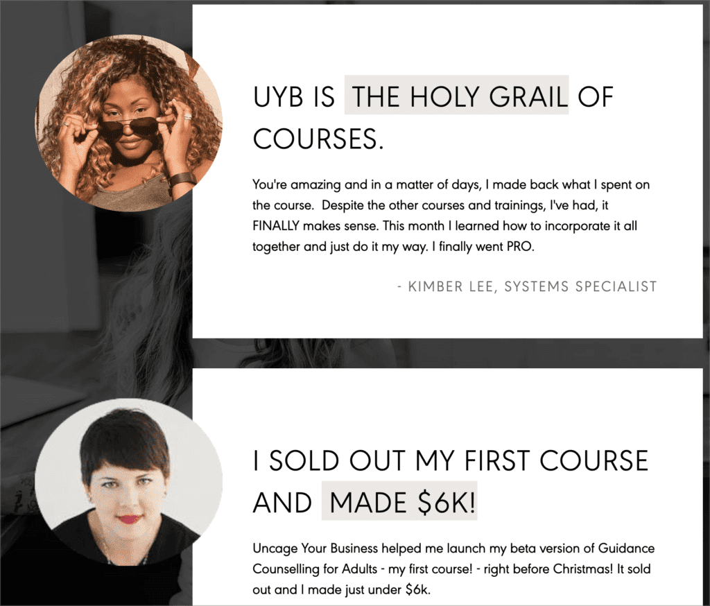

Here Becca Tracey highlights student successes, using real numbers and quotes.
6- FAQs
A Frequently Asked Questions (FAQ) section will address any of the nitty gritty details that someone might be wondering about before they purchase your course. It helps remove friction from the buying process.
A good FAQ section will show that you’ve thought things through and that your students can expect a smooth experience without surprises.
You can make the most of your FAQ section with these tips:
- Cover these key areas: course start date, course length and format, type of support you offer, and your refund policy. It’s important to include all of these in your FAQ section even if you mentioned them elsewhere on the page.
- Include questions from two distinct groups: 1) Questions asked by people that considered taking your course, 2) Questions asked by people who took the course in the past. This helps visitors feel understood.
- Place the FAQ section lower on the landing page: Often visitors will start to feel confident in making a purchasing decision, but they just have a few more questions before they can fully commit.
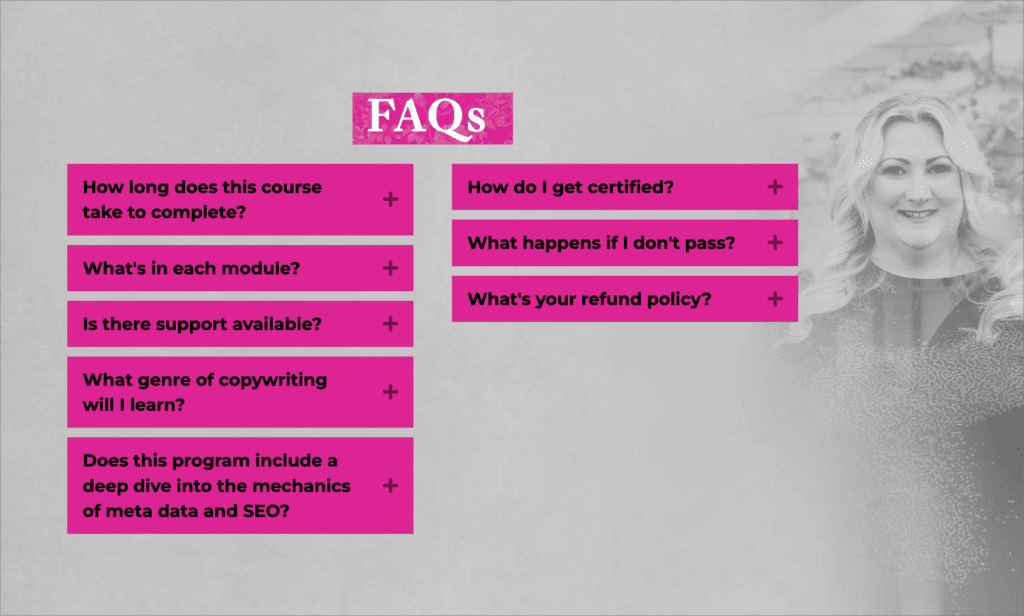

Here Kelly Diels answers questions related to her program and repeats some of the content from higher up on the landing page.

7- Pricing options
Your course sales page should include details about the cost of the course as well as what’s included in different tiers, if there are any.
You might also want to give people options in the form of payment plans, group access plans, and even trial offers. If you’re not sure how to price your online course, read this in-depth guide on creating online courses.
Here are some tips to make sure your pricing section lands the sale:
- Present pricing options in a table: If you have multiple tiers or purchasing options, present them in a table that puts them side by side and includes bullet points to highlight the key differences. This helps people see at a glance what the differences are and why they should choose one over the other.
- For longer course sales pages, feature pricing in multiple places: You might have more than one CTA button on your page, and they could take people directly to the pricing tables. However, if your course description and other sections are long, it makes sense to include pricing in more than one place.
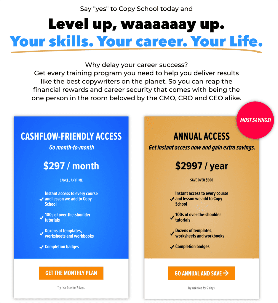

Here CopyHackers leads into the pricing tiers with a strong subhead and a few key indicators to guide people to the annual option.
8- Satisfaction Guarantee
It has become best practice to offer a Satisfaction Guarantee when you sell a course online because it increases trust.
A strong guarantee section acts as a “safety net” in the form of a refund option that helps your audience make a decision risk-free.
There are some important tips to keep in mind when creating your money-back guarantee:
- Display the time period and structure of your guarantee: You get to decide what type of guarantee you want to offer. It could be a “no questions asked” or “some conditions apply” type of guarantee, and you will want to list the details. You can also state how people can get in touch to take advantage of the guarantee.
- Research what the standard is for your type of course and price range: If you’re not sure what type of guarantee you should offer, look around at similar courses.
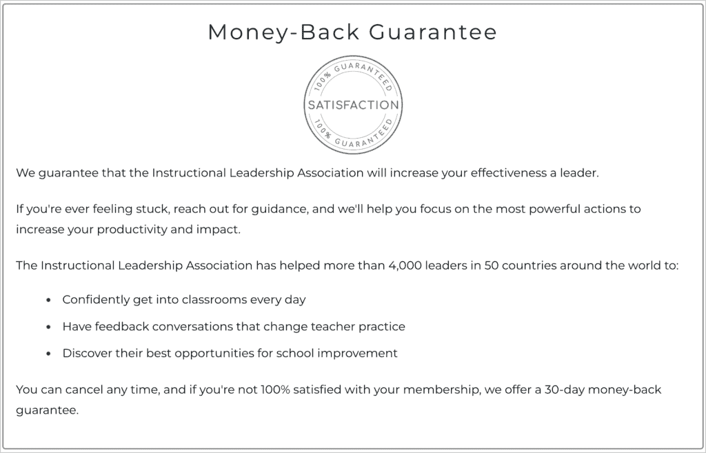

Here The Principal Center clearly lays out their money-back guarantee.


9- Teacher’s bio and story
It’s a great idea for creators to include a section that shows the audience why they are the right person to teach this course.
You don’t need to list everything you’ve ever done professionally, but you want to make sure people understand where your expertise comes from.
Here are some teacher’s bio tips:
- Keep the bio relatively short: focus on your story and how you came to teach this course. You might include why you’re passionate about the topic, too.
- Pair the bio with a headshot: this helps people connect with you as a creator and teacher better.
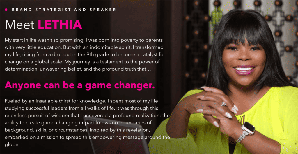

Here Lethia Owens shares her story and background, along with her belief that anyone can be a game changer.
3 Examples of Successful Online Course Landing Pages
Below you’ll find some of the best course landing page examples made with WordPress by AccessAlly clients.
Example 1 – Fourth Bird


Goal – Add to Course Waitlist
Category – Home Renovation and Design
This landing page elegantly combines visuals with the goals their ideal customers have.
Example 2 – Financial Fitness in 5 Minutes
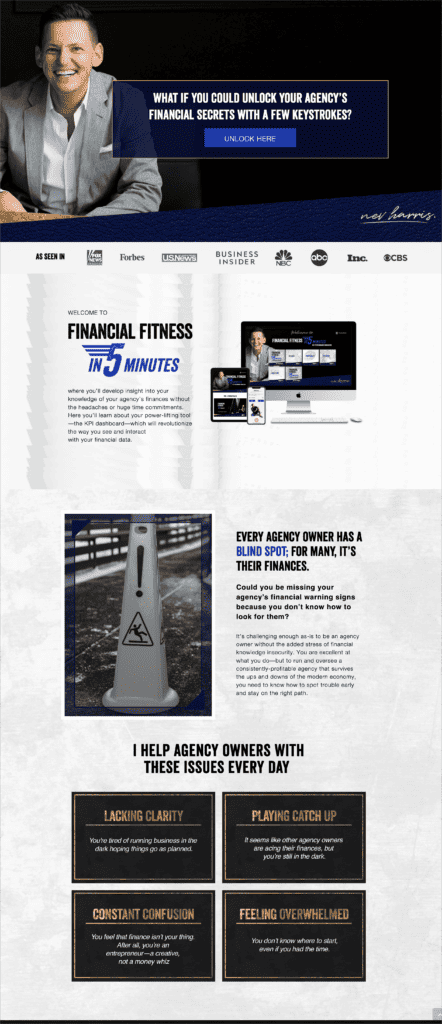

Goal – Course Purchase
Category – Finance
This course sales page effectively walks through what agency owners feel when confronted with their finances, and shows that this course can help make sense of it all.
Example 3 – Dance Nutrition
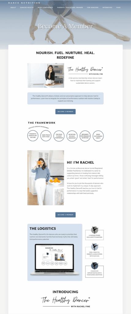

Goal – Course Purchase
Category – Nutrition
This landing page does an excellent job of showcasing the teacher’s expertise, the framework, and the logistics of the course.
