Blogging can do a lot of great things for your marketing website and your business … but sometimes don’t you just wish you could have a simple blog usability checklist to follow when you’re getting everything set up?
After all, a blog gives you a platform to establish yourself as a leader and expert in your field, which can lead to more fans and paying clients. Blogging can increase your SEO (search engine optimization) leading to more visibility. It can also allow you to provide useful content for your audience which may help them solve a problem.
Now that I’ve talked you into blogging, let’s look at the key usability components that every blog should have and why each item is important to the success of your blog.
In this article, you’ll find two separate checklists to use:
- The Feed Page – where the list of your blog posts appears
- The Single Post Page – the individual pages composed of your blog posts
Key Components of a Blog Feed Page
The blog feed page is the “Table of Contents,” if you will, of your blog. Each time a blog article is published on your website, it will automatically be added to this page. For example, take a look at the AccessAlly blog feed page here.
Get your blog off your home page!
Unless your business is your blog, your blog should not be your home page. Even though your blog is an important part of your marketing website, it’s not necessarily what people first want to see.
Instead, write up a designated “homepage” that will introduce people to your site. This home page can lead to the blog, as well as other areas of your site (such as your services and ways they can work with you).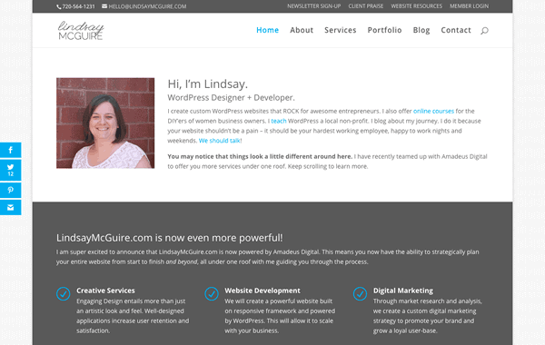

Using Excerpts
You need to make it easy for the user to pick the post that is most relevant to them and which they would like to read. You can do this by choosing to show excerpts of your blog posts on the feed page. This will ensure that only the excerpts (instead of the full content) of your articles are visible until an interested reader clicks in farther.
Think about it: if your readers have to read or scroll all the way through 5 other full posts to get to the article they want, they probably won’t last very long. Scrolling can be tedious work, especially if you need information fast!
You may also want to list your most recent posts in a sidebar, although for the feed page this is optional.

Use Featured Images
Images can really draw people into a post and quickly inform the visitor what the post is about. Be sure to be relevant and use personal photography (in other words, really try to limit your use of stock photography) whenever possible.
People appreciate real over perfect and it will make your post much more relatable, which can lead to more traffic, more shares, and more comments.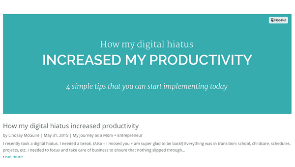

Make it all Clickable
The featured image, the title of the post, and the “read more” link should all be clickable.
Depending on the default settings of your theme and website setup, this may or may not happen automatically.
Some websites might be a little tricky and require a bit of coding to make the featured image clickable … but that’s definitely dependent on your unique website.
Set the post format
In WordPress, there is an option called “Format,” which allows you to choose the type of post you are creating (video, audio, quote, gallery, etc.).
Most themes will use this information to treat each type of post differently. For example, if you pick “video”, then your theme may add the functionality to view and play the video from the feed page and will use the video in place of the featured image.
Play around with these feature a little bit to understand the strengths of each format setting.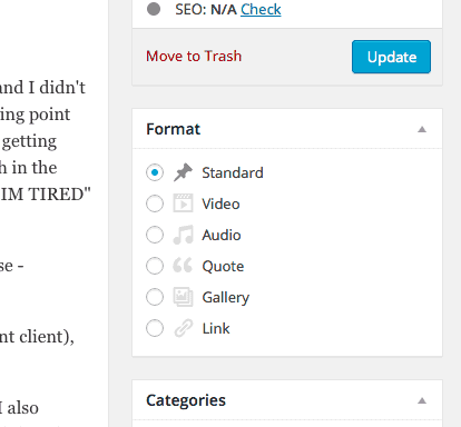

Key Components of a Single Post Page
Once you have your blog feed page set up and running properly, it’s time to dive into how the individual blog articles appear.
This can really make-or-break your blog’s “success.”
Use Large Header Text
The header text you use needs to be larger than your body content – and possibly bold. This seems obvious, but is very important and can easily be looked over.
Large header text helps readers to easily scan through your content, and provides a visual breakup of the written material you’re offering. Too much text and not enough headers or whitespace can really be exhausting for online readers.
Your theme’s default settings determine what your header text looks like. Of course, a little bit of coding can always fix the issue.
Display Meta Info
In each post, you can configure and display the meta data so the user can quickly see the author, date, category, the number of comments, etc. for each post.
You can be the judge of what you should display here, just make sure it’s helpful to the reader.
For example, if you’re the only one writing for your blog, it might not be necessary to display the “author.” However, if you often share guest blog posts, it’s totally worthwhile.
Display the Featured Image
As I stated above, featured images ROCK! Imagery is integral to keeping readers engaged and sharing your content. And I’ll say it again: please use real over perfect.
We all have those times where it makes the most sense to go to Canva.com, for example, choose a stock info, add some text and have an awesome image created for our blog.
However, when at all possible, put a picture of your face, your office, your client, your work – anything real. It may take some motivation and courage to put your face on your blog so many times, but it will be worth it and your readers will love you for being you.
That’s why they’re there in the first place 🙂
Make Sure the Text is Easy to Read
Again, seems obvious, but try to test it on a couple different devices and browsers just to be sure.
Some fonts look awesome, but aren’t easy to read through in the context of a blog article. Some readers, also, might have a hard time reading through text that is too small.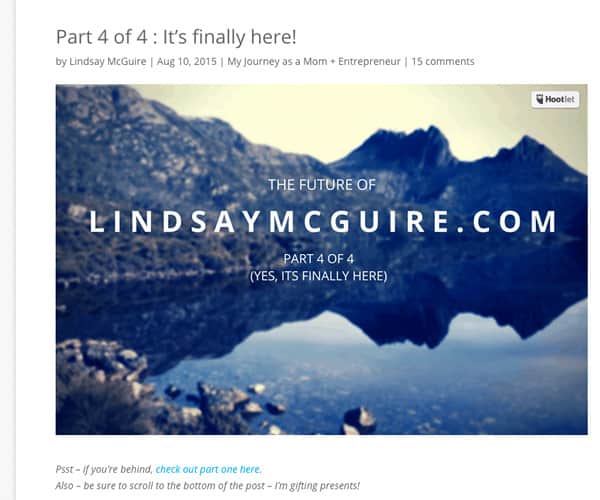

Add Sharable Content
Make awesome quotes into images or click to tweets, or simply add more images if appropriate. Make sure you brand everything, your awesome quotes may be posted (and repinned) to Pinterest and you want to be properly credited.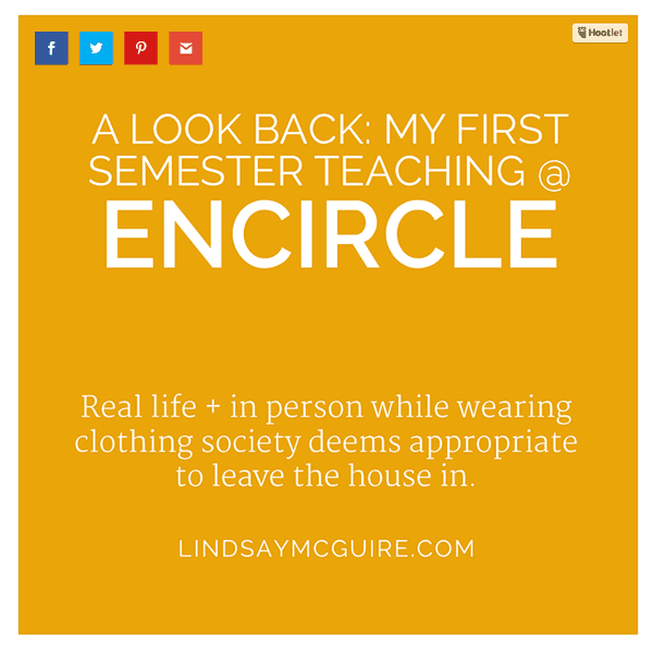

Get Social
Make sure you have an option to share the post on multiple social media outlets. Find a plugin that displays social media icons (I love Monarch by Elegant Themes).
There are a lot of display options (in a scrolling sidebar or at the bottom of the post, for example). The important thing is to have them.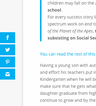

Get Your Readers To Act!
At the end of your post be sure to give your readers an action item that they can take advantage of. You could ask them to leave a comment, offer a PDF to download , fill out a form, contact you, share with their friends, or simply take action on what you have been talking about in the post.
Whatever you choose to use for you “Call to Action,” make it relevant and personal. This will really help your readers to continue thinking about your words after they’ve clicked off the page.

Allow and Display Comments
One of the main purposes of your blog is to interact with your visitors. The best way to do that is to encourage comments.
You may also wish to display trackbacks and pingbacks (when other sites link back to your blog article), so your visitors can see where your articles have been shared.
All of this helps to increase the visitor’s confidence in you.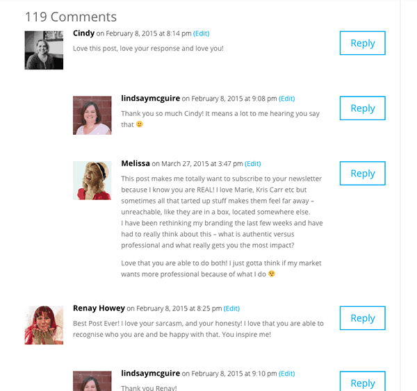

Add an Email Subscription Form
You know how important your email list is as an online marketer, so learning how to build a large email list from scratch is key. Make it easy for your readers to opt-in.
Place a form at the bottom of the post (you can easily do this using PopupAlly!).
Here’s an example of a click-to-open opt-in used throughout your post:
You’ll also find another call to action to sign up for a free offer at the end of this post.
I have found that having an opt-in at the bottom of the post converts so much higher than having one in your sidebar.
Keep the Reader Reading
At the bottom of your post, be sure to show the previous and next post links so your readers can continue reading your material if they’re loving what you have to say.
If your theme doesn’t allow for this, there are simple plugins you can use to add them quickly and easily to your site.


Now go for it! Compare Your Blog to this Blog Usability Checklist
Here’s your “homework” test 🙂 Does your website utilize the items within our Blog Usability Checklist? If not, get to work!
Now tell us…
What is your blog doing right? What do you need to implement?
Bonus points: give yourself a due date for each outstanding item.
About the Author
Lindsay McGuire creates custom WordPress websites that ROCK for awesome entrepreneurs. She has worked on hundreds of websites in the past 8 years, learning something new with each one. Her desire is to expand her skillset to bring cutting-edge development technology to her clients. She values beautiful design and functional websites, and truly believe every client deserves both.

