If you’re scratching your head and wondering what is an order bump… and why you might consider adding an order bump to your online sales process instead of an upsell, then keep reading.
In this order bump examples compilation, you’ll see the true meaning of an order bump and see how it’s different from a traditional upsell.
Plus you’ll get some order bump ideas to help you design your own highly effective order bumps, so you can increase your average order value.
What is an Order Bump and How is it different from an Upsell?
Before we dive into our order bump examples, we need to define our order bump meaning… and how it’s different from other digital ecommerce terms like upsells and cross-sells.
You’re likely very familiar with the concept of an upsell: it’s when you’re buying one item and you’re presented a second product to add to your order. Like adding a pack of gum to your basket when you’re checking out at the grocery store.
In the real world, an order bump and an upsell are one and the same. The semantic differences come when you’re talking about websites and different pages.
- An Order Bump Happens Before Someone Clicks “Buy Now”: The magic of an order bump is that it adds an additional item to your shopping cart before you complete your order. This captures the excitement of making a purchase, and it can increase the average customer value.
- An Upsell Happens After Someone Has Completed Their First Purchase: On the other hand, an upsell usually happens on the “thank you page” after someone has already finished their purchase. This can be done using a 1-click upsell, so the customer doesn’t need to enter their credit card details again and it’s a seamless purchasing process.
With both options at your disposal when you’re selling on WordPress, you might be wondering when to use each type of offer?
Order bumps make the most sense the offer is a continuation of the current product the person is about the purchase – like an add-on.
1-Click upsells are best when there’s a complementary offer or product, something that might be more expensive or that might make people question their original purchase.
For example, if your upsell includes more information or additional resources – the buyer might wonder why these weren’t included in the original product. By giving this upsell option after they’ve already committed to their purchase, you remove the doubt and only leave them with a “yes or no” decision on the second offer.
7 Order Bump Examples To Get Your Creativity Flowing
Now that we’ve explore what is an order bump and why you might want to use them in your ecommerce and digital marketing efforts, let’s take a look at some mainstream order bump examples.
You’ll see that these order form bumps are very tied to the original product – so use these as inspiration to design your own order bumps.
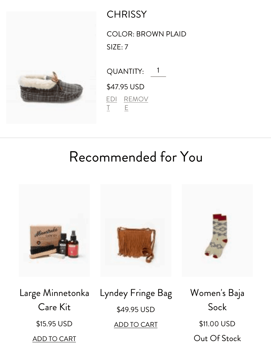

1. Minnetonka
After you add a pair of shoes to your cart, you’ll see some recommended products that complement the purchase. For a shoe company, it makes sense to upsell a “maintenance kit” – especially if you’re selling leather products. This absolutely mimics the in-person shoe shopping experience, but it happens seamlessly in digital, too.
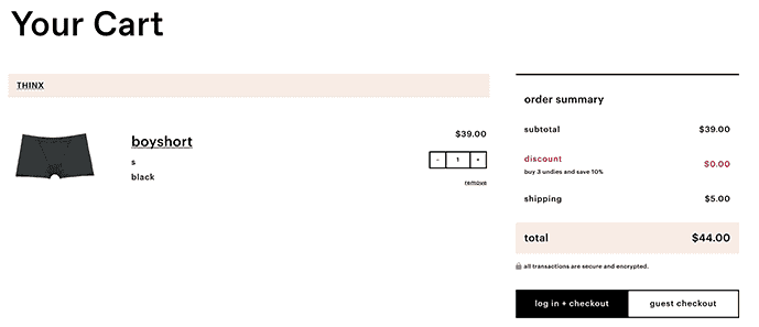

2. Thinx
Although this isn’t a traditional order bump and they could make it easier to add another pair to your order… they do have the incentive right inside the shopping cart to add more products to get an additional 10% off.
This is a twist on the usual order bump because it’s tied into a discount – but it does get you to think about adding more products to your cart before checking out.
An improved version would have a link back to the “shop” page or even a link to “add 2 more of the same product” to get up to 3. This is an order bump example that works well for businesses where buying multiple products makes sense.
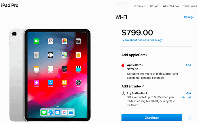

3. Apple
Apple has mastered the art of the order bump and adding different products to your cart can give you more order bump examples. In many cases, the first order bump is the AppleCare protection plan.
This makes sense for an expensive tech gadget, but you can think about adding any service that would help your clients make the most of or protect their investment in your products. There’s also a second order bump – the trade-in, which makes sense for physical products like Apple sells.
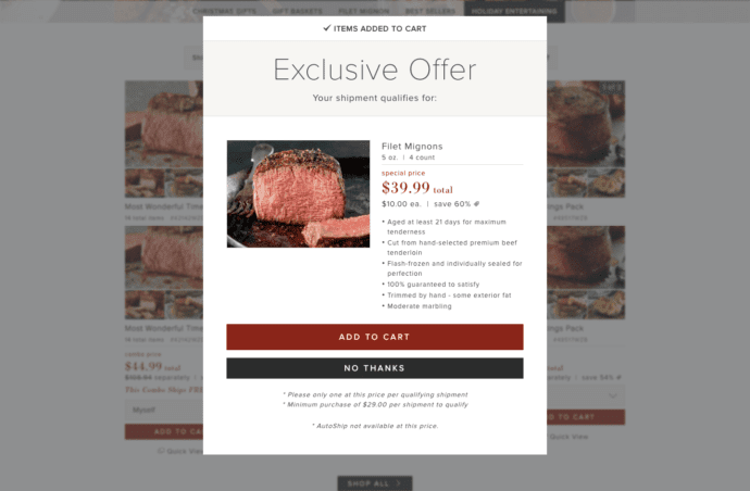

4. Omaha Steaks
Omaha Steaks is unapologetically bold with its succulent order bump invitation that appears as a prominent popup the moment you add your first item to the cart.
Since the company is known for its high-quality steaks and gourmet foods, it comes as no surprise that the order bump is for a steal of a deal on filet mignon steaks… something that anyone who’s shopping on the site will likely enjoy.
This offer comes with some smart prerequisites: the order (before filet mignon) must be at least $28. Second, you can only get one per order at the advertised 60% discount.

5. Home Depot
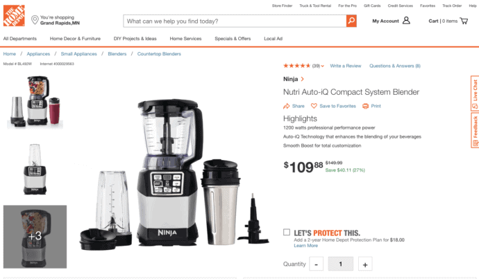
I can’t speak for all people, but when I’m at Home Depot, I’m usually shopping for gadgets or home improvement materials that I hope will last a long time.
That’s why their order bump — an offer for a Home Depot Protection Plan — is genius. Whether the item in question is a table saw or materials for a new roof, I am crossing my fingers that it will be worth the investment. As a consumer, I feel compelled to take advantage of the warranty and consider it a smart choice “just in case.”

6. Thirty-One
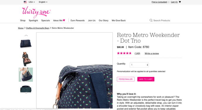
Well-known for their cute fabric patterns and overall product durability, Thirty-One has a standard order bump that’s very effective, no matter how many times you’ve ordered from them.
On every product page (and checkout form) is an invitation to “personalize” your bag, whether that’s a new purse, a weekend tote, or just a cute box for the kids’ toys. Subconsciously, it works to encourage shoppers to buy multiple items: “Maybe I’ll get one for me and one for my spouse … and personalize them, so we don’t get them mixed up.”

7. AccessAlly
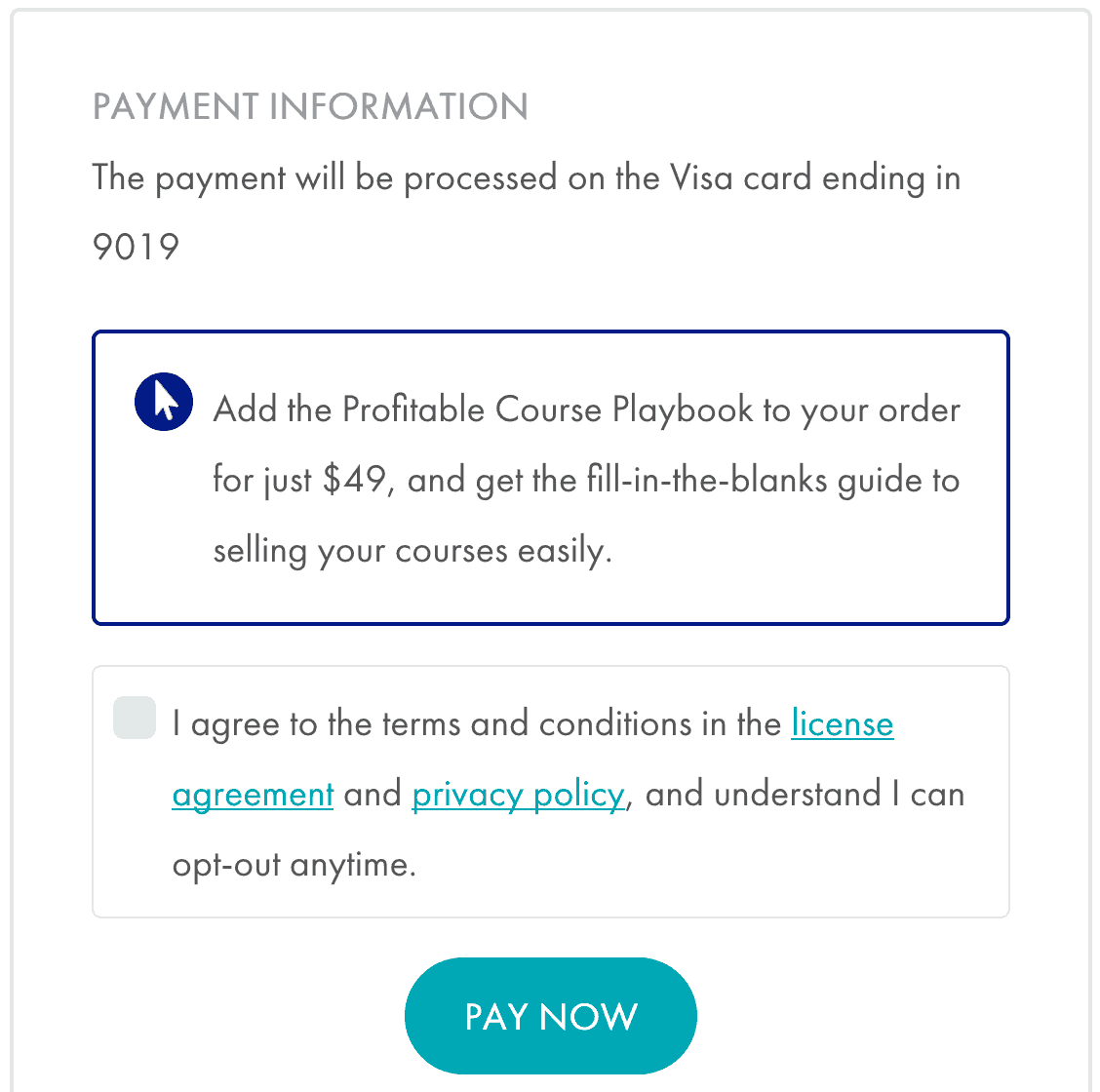
Here at AccessAlly, we’ve tested different order bumps on our own product. In this example, we’re offering the ability to add a PDF called “Profitable Courses Playbook” to the order for $49.
Since AccessAlly helps people create and sell their online courses, it makes sense for us to offer an additional product that makes it even easier for people to finish their course creation and marketing.
Got more order bump examples?
All of the order bump examples in this post are for traditional retail businesses… but order bumps work well in all kinds of ecommerce and digital businesses.
I’d love to hear what order bump examples you’ve seen in the wild, and which ones you’re considering adding to your business’ checkout process, too.
Leave a comment below to share!


