When our clients let us know they have just launched their membership site or online course using AccessAlly, our whole team does a little happy dance.
We’re blown away time and time again by the courses and memberships our amazing clients are building day in and day out. Lola L’Amour is no exception.
From the impeccable design, strategic layout, and fully customized experience this online course is sure to wow you.
“After an extraordinarily loooong search for the right platform, we’re moving all of our memberships onto AccessAlly. Thanks for building such a great product to make it happen.” -Lola L’Amour
Meet Lola
Lola brings holistic healing, ritual, and soul work into the world of high-performance leadership.
Lola’s course members area was designed and developed by her husband Tigre.
The design and layout of the site are perfectly balanced for a unique, bright, wholistic experience.
The design strategies and techniques chosen by Lola and her husband are perfectly suited to guarantee the best experience possible for each participant.
Naturally, we were excited when Lola and Tigre were willing to share a tour of their site with the AccessAlly community.
Each business and website is different, but there are some online course design best practices that you can implement on your own membership or course area.
5 Things Lola and Tigre Implemented To Make Their Course Design Successful
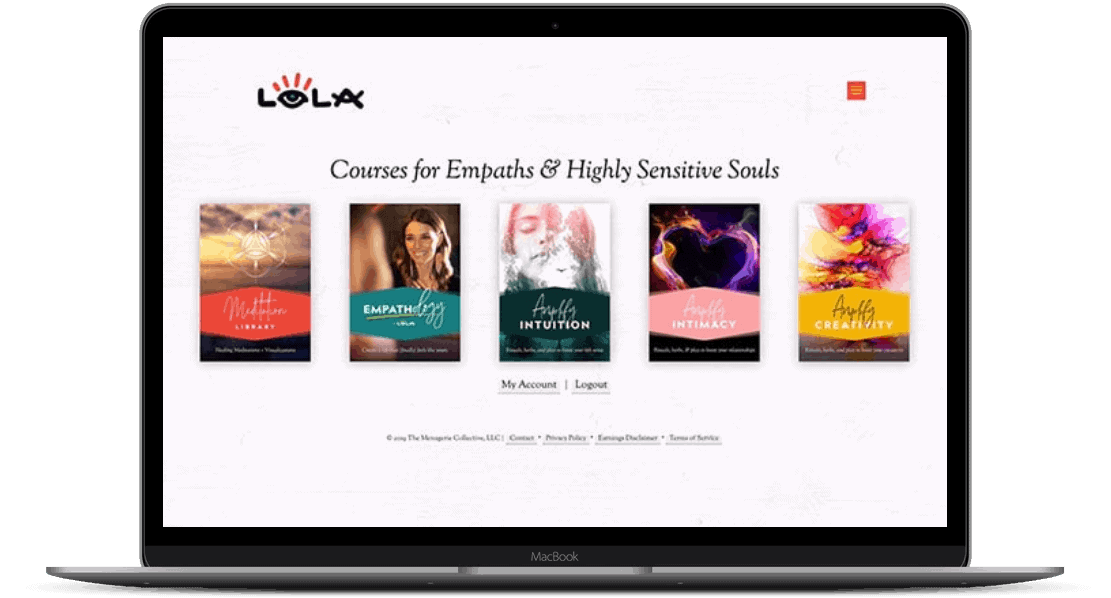
They Focused On a Clean Dashboard Design
There’s a lot of hype about the automated dashboards that help to up-sell and cross-sell your courses.
But there isn’t a ton of resources out there on how to find the layout or dashboard design that will be most attractive to your clients.
What’s better: Icons or Images?
First, there’s the “basic” icons that can be tweaked to fit any number of industries and course types. This style works well in most cases, especially when you have dozens–or hundreds–of courses to display.
In Lola’s case, a storytelling, experiential element is brought into play with each “icon” mimicking the look and feel of a book cover design. This suits her overall mission well, and is especially effective since she offers “only” 5 impactful courses, so each icon holds its own without being visually overwhelming on the page.
From a functionality perspective, your cross-selling dashboard can also be used to offer one-click upsells to purchase additional content, upgrade a membership, and link out to sales pages for additional courses you offer that the user hasn’t purchased yet.
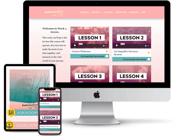
They Keep Students Focused and On Track With Organized Menus and Navigation
The next thing we loved about Lola’s course layout (in the video she gives a tour of the Empathology course, specifically) is that she takes the “dashboard” experience inside each individual course.
This is something that a lot of course designers overlook. After all, the user has purchased the course, so you might as well start throwing information at them the moment they click in, right?
While it’s not a deal-breaker to land students directly on Lesson 1 when they click into the course from the main dashboard, Lola and Tigre opted to make each course its own cohesive experience.
The course module dashboard has an entirely new feel: it’s deep and almost ethereal in tone.
It’s also easy for the user to access everything, from the calendar schedule to the module content, using the top navigation.
Notice that the top navigation in the Empathology course is different than the one that appears on the main dashboard page. This is something that’s only possible if your WordPress theme allows. See our list of recommended, flexible WordPress themes here.
Use custom menus and conditional content display to help members easily navigate through and access the courses and content they have purchased or unlocked within your site.
Lola can control exactly which content on each page a member has access to based on their permissions and only shows them programs relative to each individual user in the navigation.
This strategy helps avoid overwhelm and confusion if you offer multiple courses or membership tiers.
They Personalized Their Site to Help Each Member Know They Are Important
To personalize your site, you’ll want to implement a series of “little” details that celebrate each user as they move through your online course and membership site as a whole.
For example, you might want to include a welcome message that greets each user by name when they log in.
Or, you could implement popup messages that congratulate each member when they complete a module or course.
They Take Their Students’ Progress Seriously
Integrate progress-tracking with a learning management system (built-in to AccessAlly Pro) to motivate your course participants to complete each objective within a module, and display their progress as a percentage or pie chart so each individual knows how close they are to completing the course.
![]()
As the course creator, you can also view each individual’s progress and all participant’s progress in your admin dashboard to monitor completion rates and success with the course.
You can use this data to build in reminders for your members if you notice trends where participation decreases, or members tend to take longer to complete the content.
They Optimized Their Online Course Design for Mobile Devices
One of the most frustrating roadblocks for course creators and students alike is the difficulty of making sure that your entire membership area can be easily accessible on mobile devices.
Some of the “simpler”, done-for-you platforms have static course formats that are mobile-friendly, but don’t give you a lot of room for additional customization and layout improvements.
WordPress carries a unique challenge, since your theme and page layout will determine a large part of how well mobile users can navigate and consume course content.
Lola’s site currently uses the Divi theme, which includes elements that allow you to fine-tune the mobile-responsive behavior of each piece of content. As her course content was added to each page, she and her husband made the effort to test (and re-test!) everything to make sure it performed as desired from a smartphone or tablet.
You can go a step further and utilize elements like Snappy Login Links, which allow users to login via a one-time, custom link that’s emailed to them directly so they don’t have to struggle typing in long passwords on the tiny keyboard of a smartphone.
Putting your customer experience front and center in your online course design maximizes your customers’ results and increases the likelihood that they will purchase from you again in the future. A well thought out membership site design will increase retention rates of your members – earning you their business month after month, year after year.
Custom Design Is Worth The Investment
Not all membership site and online course platforms or plugins are built to accommodate custom design, so be sure to do your research and compare your options before investing in your tech stack.
If you’re interested in the functionality you see in Lola’s site, be sure to check out the AccessAlly membership and online course plugin for WordPress.
AccessAlly provides you with a full suite of membership and learning management system features, including e-commerce, affiliate marketing, member directories, credit systems, and so much more, but its best-kept secret is the full flexibility you have to create a completely custom online course and membership site design, unique to your business.


