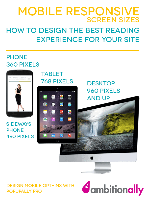
It wasn’t long ago that a “mobile friendly” website meant creating an entirely separate mobile version. I often find myself searching to see what are the latest specifications for mobile responsive screen sizes… so I figured I’d make this simple infographic that you can refer to.
That way, you’ll always knows what size to test when it comes time to create a mobile friendly popup or opt-in on your website.


Mobile Responsive Screen Sizes Explained
With each passing year, the variation in mobile screen sizes increases in complexity, presenting a challenge for modern web and app interface designers.
For example, the smallest cellphone screen size in active use is currently the iPhone 5, which comes in at 320 pixels wide.
From there, most subsequent iPhone models toggle between 375 and 414 pixels wide, with increasing viewport sizes as you move into the Galaxy phones and tablets. The average phone width in pixels is useful to have handy.
However, if someone accesses your website on a mobile device (whether smartphone or tablet), they can flip the screen sideways for a wider horizontal width.

Designing For Modern WordPress Websites
With more people browsing the web on their mobile devices, it’s important to have pixel-perfect designs that look as good on high-resolution mobile devices as they do on desktop. (Especially since Google counts mobile responsiveness as an SEO factor!)
While a lot of the weight rests in your hands as a web designer (determining the best breakpoints and resolutions for your interfaces), there are a few ways to boost the overall mobile-friendliness of your site.
1. Use a Mobile-Friendly Theme to Do The Heavy Lifting For You
Many of the simpler WordPress themes (free or premium) are easily made mobile-responsive. After all, their layout is a simple header, body text area, and sidebar/widget area. The breakpoints are already built into the theme, all you have to do is perhaps tweak the CSS a bit to make sure the text remains readable on all device sizes.
However, more complex designs (think multi-layer backgrounds and stacked columns) require a bit more care to ensure they respond correctly with a reduction or increase of screen width.
This is where you’ll want to look for a more refined theme/page builder plugin that can save you hours of customized CSS and increase the quality of the end result.
The Beaver Builder plugin, for example, includes built-in settings that make tweaking breakpoint sizes as easy as a click of the button.
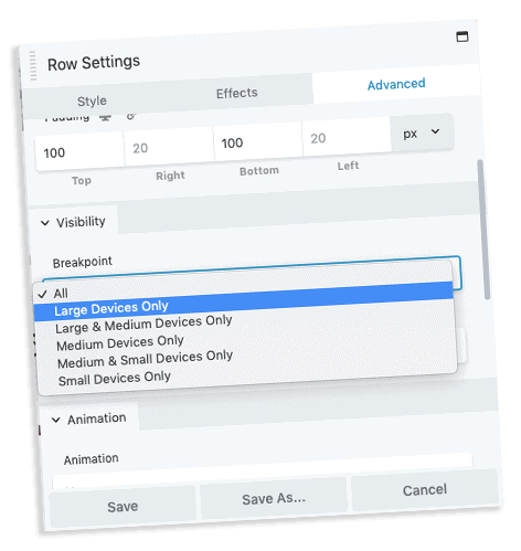

It also includes an option to change the stacking order of a column. Again with a single click.
There’s another WordPress theme that allows you to test website on different screen sizes, which is Bricks Builder. Find out how we migrated to this theme and why we completely failed to test on different cell phone sizes before we went live.
2. Only Install Plugins That Are Designed Mobile-First
Whether someone has a 4 inch screen smartphone, or you’re trying to figure out the average monitor size pixels you need to design for, it’s important to consider plugins that are mobile-first.
Themes and static page designs are one thing, but as you increase the functionality of your site, it’s important to make sure that none of the moving pieces drop the ball on the mobile experience.
For example, stats tell us that 75% of people who shop on your website will never actually complete a sale because they abandon the cart without purchasing.
It’s not that they don’t want to. For a large number of those would-be customers, something actively comes between them and the product they added to their online cart. That’s why the right dimensions responsive settings are so important.
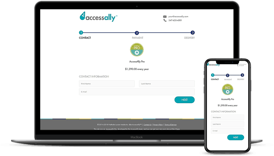


Unfortunately, the checkout experience itself contributes to this loss of revenue, especially if your order forms aren’t mobile friendly.
It’s the tech issue that makes a mobile visitor throw up their hands in frustration (“I’ll buy this later, when I’m on my desktop”) and never return to complete their order. (Or worse, they complete their order with a competitor. Yikes.)
That’s why choosing a mobile responsive subscription plugin that’s actively developed with modern screen sizes in mind can either make or break the overall success of your site design.
I hope this list of common bile screen sizes helped you in your tasks today, especially if you are a developer needing dimensions for mobile website options.


