I love websites because they hold so much potential.
They hold the potential for you to quickly (and simply) tell people what you do and motivate them to take action. What actions, exactly, do you want people to take on your website?
While this may vary depending on where you’re at in your business, for most coaches the primary action you want people to take is to join your list.
You want people to join your list so you have the opportunity to communicate with them (by sending emails) and build a relationship with them.
If someone comes to your website and leaves without entering their name and email, it’s likely they won’t return.
Once someone has joined your list, the next action you likely want them to take is to schedule an initial consultation with you (and become a paying client). If you don’t work with 1:1 clients, you might want them to purchase an ebook or sign-up for an online program.
If you’re feeling frustrated because your website isn’t helping you grow your business as quickly as you’d like, don’t worry! It’s totally fixable.
I’m going to share the 7 common mistakes I see on health coaching websites.
As you read through these, don’t beat yourself up for any mistakes you might be making. Trust me, you’re not alone. Instead, look at this an opportunity to give your website a review and create an even more powerful site that helps you bring in more revenue.
Here are the 7 common health coaching website mistakes that are costing you clients…
Mistake #1: Your home page is too busy
You have 7 seconds to grab someone’s attention once they land on your site. If your home page it too busy, it’s likely that people are arriving on your home page and leaving without taking any action.
- Does your home page have too much text?When people arrive on your home page, they won’t have the attention span to read a lot of text.
- Does your home page have a slider/slide show?While sliders can look pretty, they don’t give you control of what your audience sees. Because slideshows are constantly cycling through different images, you’re not able to keep the most important message front and center.
- Does your home page have a sidebar?The sidebar is the right-hand column of a page. It’s best not to have a sidebar because it gives your visitors too many places to click and distracts them from the main actions you want them to take.
Mistake #2: Too many options in your main navigation.
One of the biggest mistakes I see coaches make is including too many options in their navigation.
It’s very easy to come up with 10 pages – or more! – that you want to have on your website. There’s so much you want to share with your audience. It’s easy to get into the mindset that if we give more information, people will be more likely to work with us.
The truth is that less is more.


The same advice goes for your membership site navigation too. Take a look at this online course template walkthrough for more examples.
Mistake #3: No clear call to action on each page of your site.
Think of your website as a simple roadmap with just a few options of where to go, when to stop, and when to make the next turn.
Avoid having your website become a maze, where your website visitors get lost or off-track from taking the key steps you’d like them to take.
Each page of your website should have one step you want people to take and it should be clear what that step is. This may be opt-ing to your free gift, signing up for a consultation with you, purchasing a product or program, or clicking to another page on your site.
Mistake #4: Too much information about your programs
Back when I was a health coach, I had 3 different private coaching programs. I made the common mistake of listing all the details of these programs on my website.
At the time, it felt crucial for me to share all of the features of each program. Instead, I should have focused on the benefits of working with me (i.e. the results they would experience).
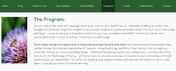

As a coach, you likely know that if you give your clients too many options, they will feel overwhelmed and won’t take any action.
You can keep prospective clients out of overwhelm by limiting how much information you share with them, focusing on the benefits/results of working with you, and inviting them to schedule a strategy, breakthrough, or discovery session.
Mistake #5: No free opt-in gift promoted
We’ve already talked about the importance of using your website to build your email list. The best way to motivate people to provide their name and email is to offer them a free gift that will help them with their main pain point or their main desire.
If you have an opt-in box on your website, but simply promote “sign up for my newsletter” or “join my list,” that is not nearly as compelling as a free gift that provides valuable information that people will receive immediately after entering their name and email.
Mistake #6: Your opt-in form is small and “below the fold.”
Where is your opt-in form on your home page? “Below the fold” means that people will have to scroll down to see it. You want the promotion of your free gift and the opt-in form to be prominently placed “above the fold.” This ensures that people will see it immediately upon landing on your home page and it will increase the opt-in rate of the offer.
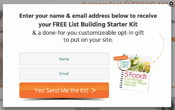

Mistake #7: No pop-up
When I mention “pop-up” it may conjure up negative feelings about salesy websites, and you may think that you would never want to use a pop up. I completely understand this, but there are some very friendly ways to use pop-ups that are extremely effective for building your list.
One of the least intrusive ways to use pop-ups is to have a pop-up show up when someone is about to leave your website.
By setting up a “polite” pop-up on your site, you’ll be able to get more of the people who visit your website to opt-in to your list. This means you’ll build your list more quickly. Of course, our favorite pop-up plugin is PopUpAlly :).
As I mentioned above, don’t fret if you’re making these mistakes on your website because you can totally turn this around.
Want additional tips on how to get more clients with your website?
I’m going to show you exactly what to do. Click here to download my FREE Client-Getting Took Kit>>
I’d love to hear from you. If you have a website, take a look at it with fresh eyes. What would you like to tweak to make it more effective? If you don’t have a website, what is one thing you want to make sure to implement when you build your site?
About Amy Lippmann
Amy Lippmann is a Marketing Strategist & Founder of Marketing for Health Coaches. Amy attended the Institute for Integrative Nutrition and was a health coach for 5 years before realizing that her true gifts are in online marketing strategy and implementation. Amy founded Marketing for Health Coaches, which specializes creating high-converting websites, list building, and ready-to-launch programs. Want additional tips on how to get more clients with your website?

