Long-form, short-form, green buttons, red buttons, testimonials, sales videos.
The jury’s still out on the best strategy for designing sales pages that convert to produce optimum results for your business.
But, if you ask me, there’s not just one right way.
And here’s why:
Your sales page is unique to your business, and what works for your colleagues may not work for you because each and every one of us serves a different audience.
What matters most is that you design sales pages that convert.
There are a few key fundamental pieces you’ll want to include whether you’re selling online courses, selling a membership, or anything else online.
The key is focusing on solving your ideal customer’s problems.
Together we’ll break down 10 sales page examples across varying industries, all unique in their layout and design. Each one offers a solid example of sales page strategies that convert.
Plus you’ll see what tools we recommend for designing your next WordPress sales page and the must-haves for every sales page design.
Let’s dive in.
10 Sales Page Examples for Online Courses, Memberships, and More
1. Your Story School

What it’s selling:
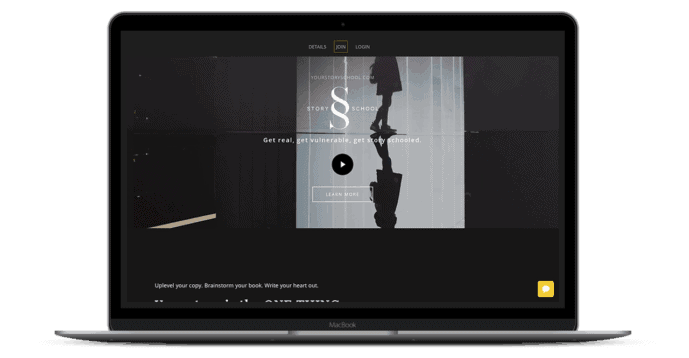
Your Story School is a 12-week course & group coaching program that teaches copywriting and storytelling.
Where it shines:
The Story School sales page example follows a story structure true to the Story School copywriting program itself. The customer gets first-hand experience of how powerful the program will be if they are convinced to buy.
Each section of the page visually leads into the next so that you’re compelled to continue reading and navigating through the page until you’re prompted to purchase, or keep scrolling for more information.
Structurally, design elements have been used to visually separate each part of the story, as if they are chapters that make up a whole.
The sales page gets more granular in terms of details for the program, the further you navigate through it. This approach works well, for potential customers who may have doubts because they have likely already been convinced the program is for them, but just aren’t ready to pull the trigger.
By the time they reach the end, most (if not all) of their pre-sale questions are addressed.
Where it could be improved:
I would recommend adding a footer with contact information, a privacy policy, and using an ssl certificate for the page to help the potential customer feel more confident in their purchase.
One thing to consider with your sales videos is to make them engaging and draw the viewer in instantly, the moment they click play.
The sales video at the top of this page fell a little flat, but contained great information when I gave it a chance. Don’t risk losing sales, and your potential customers’ attention with a video that doesn’t capture them immediately.
2. Created Life Academy
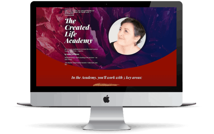

What it’s selling: Created Life is an integrated in-person, coaching & retreat event for women who are looking for help in achieving their goals.
Where it shines:
This sales page does a great job connecting at a human level and appealing to those who the program is meant for, and a connection with the program leader is immediately made.
This example explicitly states who the program is “NOT” for and also requires the customer to go through an application process – instantly qualifying the potential customer. Not everyone who wishes to enroll will be selected. This approach sends the message to the potential members that it’s about quality, not quantity.
Where it could be improved:
In theory, the use of rotating testimonials is a great way to showcase multiple trust-building statements.
Unfortunately, on this particular sales page, the testimonials transition from one to the next so quickly that it’s impossible to read through one before another appears in its place. Ultimately, this doesn’t deliver a ton of value for the potential customer.
3. PR Couture PRISM Program
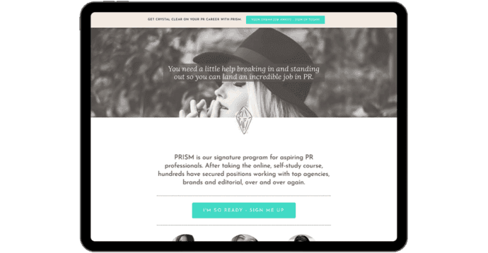

What it’s selling: PR Couture’s PRISM Program is a program for aspiring PR professionals.
Where it shines:
There’s a strong brand presence throughout this entire sales page example, from the prism logo that appears between each main section to the font style and color palette used throughout.
Even though the content is well-done and covers the essential “should-you-buy-it-or-should-you-not” elements, there’s a prominent invitation for interested students to email the company directly with any questions.
For this particular product, the extra invite isn’t going to be a big threat for the overall conversation rates. After all, it’s intended for individuals who are looking for a career in PR and communications, so they should be ready to dive in and take the extra step for clarification.
Where it could be improved:
There were a few areas on this page that didn’t fully meet my expectations.
Right above the program overview, there are 3 headshots. It’s immediately unclear who they belong to … are they past participants? Program leaders?
To help clarify this point, it’s a good idea to include short testimonials next to the headshots (if past participants) or a short intro/bio if the images are of program leaders.
Finally, while the “email us” invite isn’t a negative element, it’s still a good idea to include a sign-up link or button at the end of every sales page. This way, if a potential customer makes it to the end and aren’t ready to submit an order at that time, you don’t miss out on the sale entirely.
4. Kit
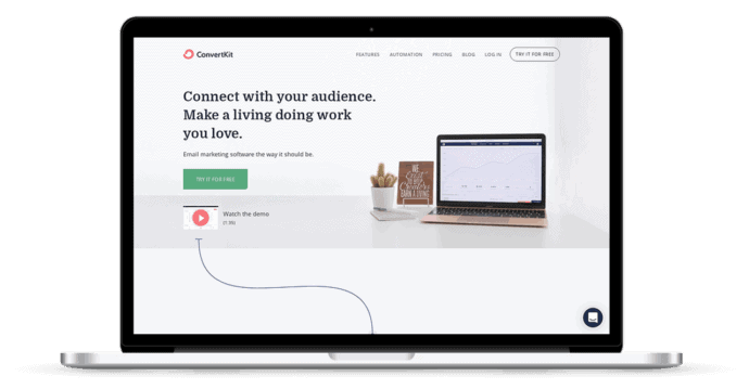

What it’s selling: Kit is an email marketing automation platform, sold as a SaaS product.
Where it shines:
ConverKit’s use of connecting points to draw the potential customer’s eye down the page to keep the viewer moving through each section of content is brilliant.
At the top and bottom of the page they qualify their leads by redirecting them to sales materials and resources based on their stage in business before presenting pricing that aligns with each demographic’s needs.
The use of testimonials in this design is relevant and specific to the feature its presented with – adding a personal connection to illustrate the potential each feature offers for the business owner.
Where it could be improved:
The “Watch the Demo” callout is minute in comparison to every other section of the sales page layout. When clicked, it opens up into a larger player as expected, but gets lost due to its size in the current layout.
5. What Works Network


What it’s selling: What Works Network is a professional online community and training for small business owners.
Where it shines:
This WordPress sales page example is just stunning from a design perspective … but the layout and imagery isn’t the only thing they nailed here.
The placement of the sales video just below the fold is outside the norm, but works really well here for a few reasons: When I land on a sales page and the video is the first thing I see, I feel obligated to watch it (or else I won’t get all of the information I need).
Second, not everyone who lands on your sales page is in an environment where they can watch the video, or have enough info about your program or offering that they want to commit the time to do so. In this case, the potential customer gets a brief overview of the program first. If the initial hook resonates, they’re more likely to watch the video and continue engaging with the page.
The use of social proof and “you belong” copy instantly makes you feel like you’re part of this community before you fork over your hard-earned cash. The animated calculation of members and the community/content numbers catch your eye and draw a lot of attention to them, driving home how active the community is for members.
I think it’s fair to say that testimonials are a must-have on every sales page design. In this case, the testimonials are laid out in a modular design, which makes them really stand out visually, making it easier for you to read each one in its entirety before moving on to the next.
Where it could be improved:
This sales page is so beautifully designed and organized that it was hard to find an area for improvement.
The only point worth mentioning here is the lack of an SSL certificate on the site. Although payments aren’t being processed on the site, some visitors may be turned off by the “Not secure” message in the address bar. It’s a small investment to protect the page with an SSL certificate.
6. Isabel Foxen Duke – Stop Fighting Food
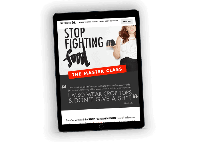

What it’s selling: Stop Fighting Food is a program that helps develop healthy eating mentality and habits.
Where it shines:
While not designed to appeal to the masses, the language and photo selection used are bold and speak directly to the intended audience.
The design features a mix of written and video testimonials that are eye-catching by framing them with a grey background that contrasts with the white used throughout the rest of the page, with large arrows pointing to the written testimonials. The viewer has the option to engage with them in a way that resonates most for that individual – video for those who prefer hearing directly from past participants and written for individuals who either aren’t able to play the video at the time of viewing or prefer to quickly browse through them.
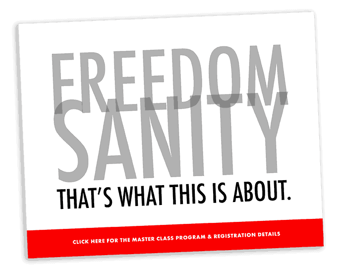
I’d also like to draw attention to the use of the dramatic text at the end of the page. In this case the content serves a dual purpose – the message is conveyed through the written copy, but it also doubles as a visual design element.

Where it could be improved:
Although the page uses professional photos for the most part, there’s a section that feels totally out of place with an assortment of stock photos (the black and white filter isn’t enough to bring the photos back on-brand with the rest of the page).
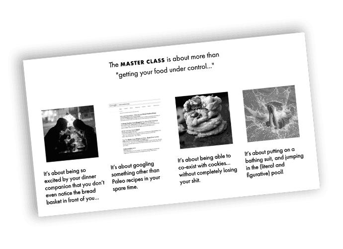

In this case, it probably would be a much better idea to consider using icons rather than basic stock photos to avoid that feeling of disconnect with your website visitors.
7. ONTRAPALOOZA
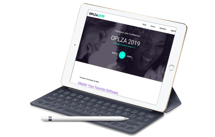

What it’s selling: Ontrapalooza is an annual conference for users of the Ontraport marketing automation/CRM software.
Where it shines:
The team at Ontraport has done a great job making it easy to purchase in the sales page design for their annual event, Ontrapalooza. Since it’s a part of the fixed navigation, the “Register Now” button is always visible as you scroll down the page. It’s always present and conveniently located for the buyer to proceed with their purchase at any given moment.
A black “Register Now” button is also embedded throughout the page after every section.
While largely black and white in design, the pops of color framing the images and as headings create movement for the page from one section to the next. This helps break up the content so the viewer isn’t overwhelmed with all of the information being shared.
Where it could be improved:
Knowing this company has the resources for professional grade photos, it would have been nice to see more of them used throughout the design for a more professional, polished look.
One way to build credibility for your offering is to use a “featured in” or “as seen in” section for social proof. In this design, I would have liked to see the “as seen in” section in a more prominent, full-width area, instead of nestled under a short content area. In this case it looks as if it was added in as an after-thought.
8. StoryBrand Marketing Workshop
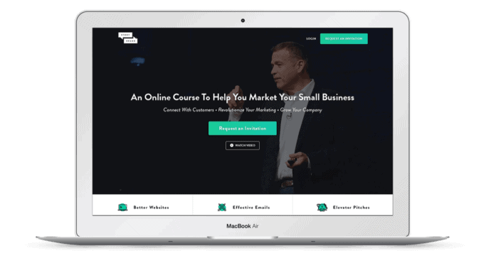

What it’s selling: StoryBrand Marketing Workshop is an online course that teaches higher level marketing strategy.
Where it shines:
StoryBrand does a great job creating exclusivity for their offer by requiring you to request an invitation, rather than make a purchase directly. (It’s also a smart way to gather a list of warm leads.)
They do a great job qualifying leads by immediately addressing pain points at the top of the page, as well as how to solve them through video testimonials from past clients. The potential customer immediately feels confident that StoryBrand understands what they’re going through and knows how to help them.
The clean modern feel and nicely spaced copy make this a refreshing, uncluttered sales page design. The sliders, tabbed content, and video players throughout are well-organized and force the customer to immediately engage with the brand.
The testimonials throughout the page make the course relatable, and the use of testimonials and endorsements from “celebrity” entrepreneurs builds confidence in the buyer and a trusting relationship with the brand.
Where it could be improved:
In the “What You Save” section below the pricing box it’s unclear how this course compares in terms of content and intellectual value to the offers listed in the price comparison.
While it’s clear this offer is more affordable in comparison, there’s not any context regarding the additional offers to help the customer feel they’re making a good investment for the value they will receive from this offer.
9. Fearless Art
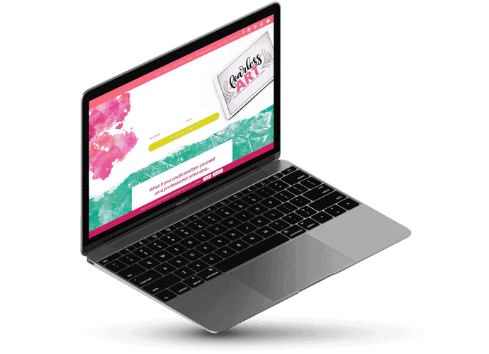

What it’s selling: Fearless Art is an online course that teaches artists how to grow in confidence and gain clients.
Where it shines:
This WordPress sales page example showcases the brand and personality of the site owner very well, but also keeps the focus on the potential customer and the transformation they’ll go through when they sign up.
The site isn’t design heavy, but the watercolor brush-stroke backgrounds create nice visuals to break up the content.
This example also does a good job of building credibility without the use of testimonials. Shawna tells her story and uses her art on her page to showcase her expertise and build confidence in her potential members.
Where it could be improved:
At the bottom of the page, there’s an additional opt-in that’s unrelated to the sales page offer. This really distracts from the program as a whole.
Even though this specific offer is currently unavailable, there’s a waiting list for leads to join. The site owner can use the waiting list to segment these leads into their mailing list to keep warm until enrollment opens without the need for the second opt-in.
10. Design Sprint MasterClass
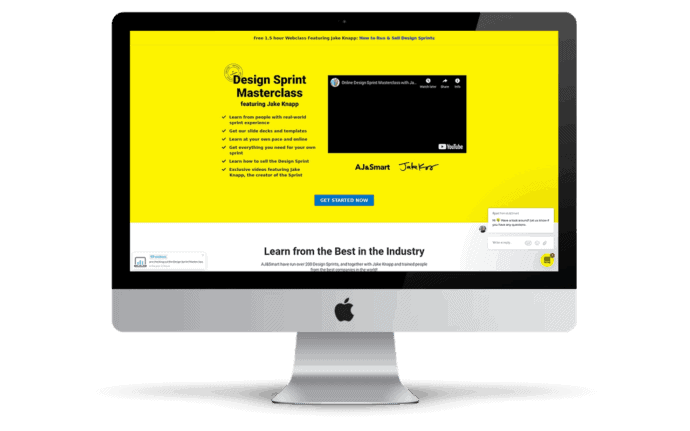

What it’s selling: The Design Sprint MasterClass teaches professionals how to run a successful design sprint.
Where it shines:
This sales page immediately communicates what’s included in the offer and the results you can expect as a customer.
The site owners create a strong desire for their services with the use of the names/logos of their high-profile clients as soon as you scroll for more information – building instant trust with you in their work and ability to deliver on their promises.
You can also chat with the business directly on the page so you can get an immediate response to any questions you have while you’re on the page, ready to make the investment.
I also appreciate how they allow the potential customer to experience program first-hand with a sneak peek at the program.
Where it could be improved:
The biggest flaw in this example is, even though this sales page is promoting a program for designers, the creators haven’t invested the time to put together a well-designed and polished sales page for their offer.
This page has a lot of potential in terms of content, but there are some major areas for design improvements and conversion optimization which are likely due to the use of a non-WordPress sales page template.
Every sales page should include testimonials, however, the excessive use of them can become distracting to the customer. In this case, the testimonials look cluttered in varying sizes, and make up a large majority of the content on the page. A little extra time investment in organizing this content can go a long way for conversions with your potential customers.
The designer had good intentions with the inclusion of the curriculum breakdown in the layout but it’s off brand and doesn’t utilize the same design elements applied throughout most of this design.
You want to avoid linking out to external sites and free offers from your sales pages as much as possible because it can take the attention off the program you’re selling and distract your potential customer.
Lastly, they don’t link to their order forms enough. You want to make it easy for your potential customer to enroll when they’re ready to buy. After the first opportunity to enroll at the top of the page, I had to scroll a lot to find the enrollment button.
3 WordPress Sales Page Design Tools
Now for the real question: how do you take the ideas from the sales page examples and apply them to your own WordPress website?
The days of coding in HTML, CSS, or Javascript to build beautiful, well-organized sales pages and websites are a thing of the past.
Although you can still have a developer build a fully custom design for you, there are a variety of tools that let you create beautiful layouts and add the functionality you need, without having to reinvent the wheel code-wise every time.
1. WordPress “Page Builder” Plugins
Page builder plugins have made it possible for beginner and advanced WordPress users alike to create a professional design without the need for a custom LMS theme or development.
The debate is wide open when it comes to the best page builder, and strong arguments can be made for and against almost every tool on the market. So, in lieu of a comparison post, we’re going to keep it simple and share 3 of the more common page builder plugins that our clients use.
All of the options below allow you to design in a WYSIWYG interface.
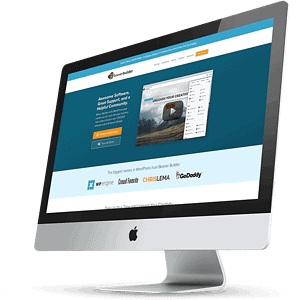
Beaver Builder
Beaver Builder is the page builder we use here at AccessAlly.
The interface is easy to use, it loads quickly, and met all of the requirements we had as a company at the time of our site redesign. Like many others here you can save page templates, rows and other global elements for use site-wide.
One of the features that sets Beaver Builder apart from some of the other page builders on the market is the detail on design elements in regards to movements and animations. It’s a popular choice when design is a heavy focus for the site creator and has little to no learning curve.
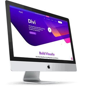
Divi by Elegant Themes
Divi is a feature rich theme builder, and gives you a ton of options with its page builder. Due to its flexibility, you have full design control over your site.
In addition to the pre-made built-in templates, you can also share and download layouts and content from the Elegant Theme community.
Although Divi can be overwhelming for beginners, over the years it’s become an incredibly popular choice for WordPress users.
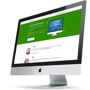
ThriveArchitect
ThriveArchitect has over 275 landing page templates and its focus on marketing makes it a prime choice for online business owners and marketers alike.
When your top priority is optimizing for conversions and sales, you can’t go wrong with this builder. It’s a true drag-and-drop, click-to-edit builder with pre-designed conversion elements that allow you to put together a landing page, or sales page in no time at all.
2. Opt-In Plugins
Some sales pages simply include a button that links directly to a pricing page or order form. But if you have a limited launch time (or are simply in pre-launch mode), you might want to collect email addresses instead.
1. The Built-in “Page Builder” Plugin Opt In
All of the page builder plugins mentioned above include an “opt in” element, so you don’t have to add any more plugins when it comes to the part where you want to collect emails. Typically, they include a setting that will allow you to link the opt-in up with your email marketing tool, so each submission gets added to your email list.
The downside is that not all email marketing tools are supported.
2. Your Marketing Automation Tool
Another option is to use the opt-in tools provided with whatever email marketing automation tool you’re using.
This can be a great option especially if your marketing automation tool (whether that’s ActiveCampaign, Drip, Kit, etc.) allows you to “embed” an opt-in with code … which means that you can place the opt-in strategically throughout your sales page.
3. A WordPress Opt-In Plugin
Finally, if you’re not able to find the right solution with either of the first two options (or if you want more flexibility for popups and time-activated opt-in offers), you might want to do some searching for a WordPress opt-in plugin.
The natural first choice we recommend is PopupAlly Pro, but that’s not just because we created it!
PopupAlly Pro allows you to create popups, embedded opt-ins, scroll-activated opt-ins, exit-intent popups, and more.
3. An E-Commerce Plugin To Seal the Deal
Finally, it’s important to have a plugin installed on your main site (or a subdomain) to allow your users to place the order itself.
Common options include:
- AccessAlly (Essentials or Pro), which acts as your WordPress subscription management plugin and makes it possible for you to design your own order forms and collect payments for anything from one-time payments to payment plans to open-ended membership subscription plans
- WooCommerce, a WordPress plugin that includes shopping cart functionality
- Shopify, a third-party system (cannot be installed on WordPress) that can give additional functionality, from shopping carts to shipping assistance with physical products
What’s the best way to pick the right E-Commerce tool?
Great question. There are some elements where you might be able to make a quick decision based on features. Someone with hundreds of physical products, for example, might find it much easier to use a tool like Shopify, which is designed with that business model/style in mind.
If you’re selling primarily online courses and memberships, you might gravitate towards AccessAlly for a robust, all-in-one-solution, since it includes your course-building and membership site elements.
Take time to reflect on your business model and what tool makes the bulk of your online selling easier.
Design Sales Pages That Convert For Your Website
… and now, it’s your turn to create sales pages that convert. Whether you’re selling physical products or online courses and memberships, it’s important to make the entire experience seamless from start to finish.
Take time to think through the layout, content, and strategy behind each sales page on your site, and invest in a tech stack that does all the heavy lifting for you.
Each of these WordPress sales page builders are also highly recommended for building online courses and membership sites.

