7 out of 10 potential customers abandon your checkout page and never look back.
How much income do you lose with this number? Checkout flow optimization matters.
Imagine what your revenue could be if you were able to reduce that 70% checkout form statistic to just 50%.
Fortunately, there are some tried-and-true strategies that you can put in place to maximize your checkout form conversion rates in your business.
Let’s take a look.
7 Strategies to Maximize Conversions On Your Website
1. Recapture Lost Sales With Abandoned Cart Follow-Up
One of the most powerful methods to capture potentially lost sales on your checkout page is using an abandoned cart follow-up campaign.
You can make this follow-up process as complex or simple as you’d like, but at the very minimum you need their email address.
Here’s what it might look like:
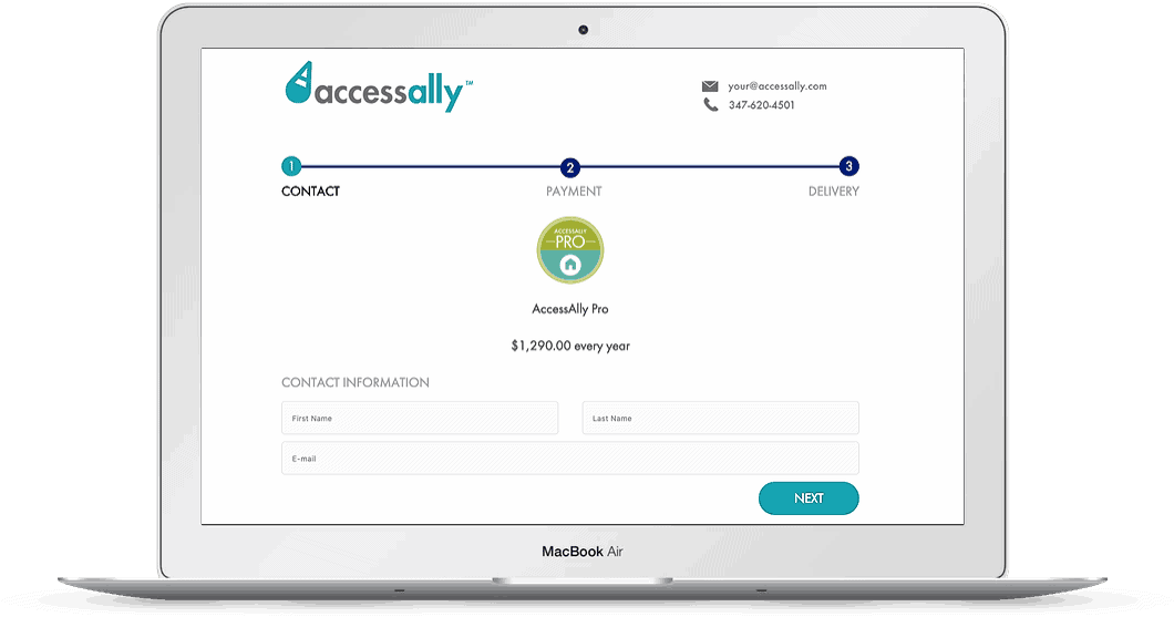

The AccessAlly recurring subscription plugin, for example, uses a 3-step checkout form, designed to collect a customer’s first name, last name, and email address in the first step. Once they click on to the next part of the order form–the billing part–their contact info is logged into our marketing automation system/CRM. This way, if they never submit the order, we can send follow up emails to this email address, completed with an incentive to come back and purchase.
We’ve recouped 43% of potentially lost sales with this method alone.
This same process can be used for physical products as well.
2. Don’t Overwhelm The Buyer
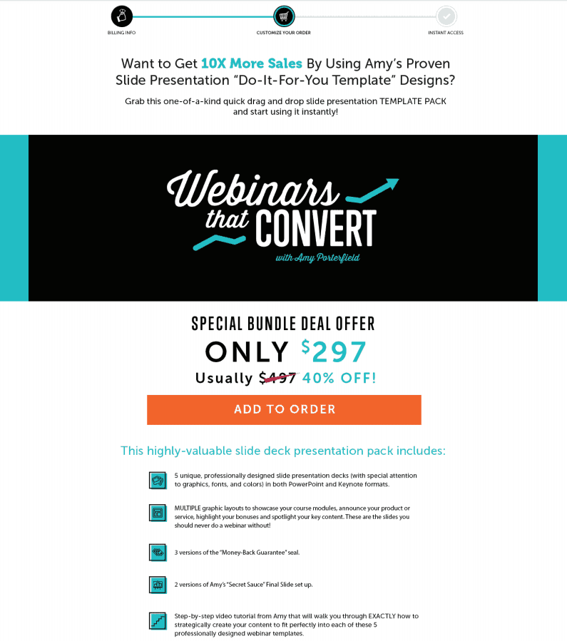
When asking customers to fork over their hard-earned dollars, you want to make it as easy as possible for them to move from sales page to order form.
This is where a lengthy checkout flow can wreak havoc on your conversion numbers.
As a general rule, only require customers to fill in the fewest fields possible for you to successfully deliver their purchased goods.
If you’d like to collect additional information from your customers, you can do so on the confirmation page or in a follow up email to them after the purchase is complete.
After all, the more time they spend giving you information that’s not necessary to fulfill their order is more time spent deciding whether they really want to continue with their purchase.
The more time they spend on your order form, the higher your lost sales numbers will be … which is another reason why adding things like 1-click upsells can continue to increase your revenue.

You’ll also want to take into account any additional security measures like the recent European Secure Customer Authentication steps that are part of your payment processor.
3. Mobile Responsive Checkout Forms
According to this study, 79% of customers submit their orders on mobile devices.
If your order forms are not mobile responsive, you’re leaving money on the table. Money you may not be able to recoup.
Ensure all of your checkout forms are mobile friendly. Your buttons, images, and all text should properly function and re-size across all mobile devices.
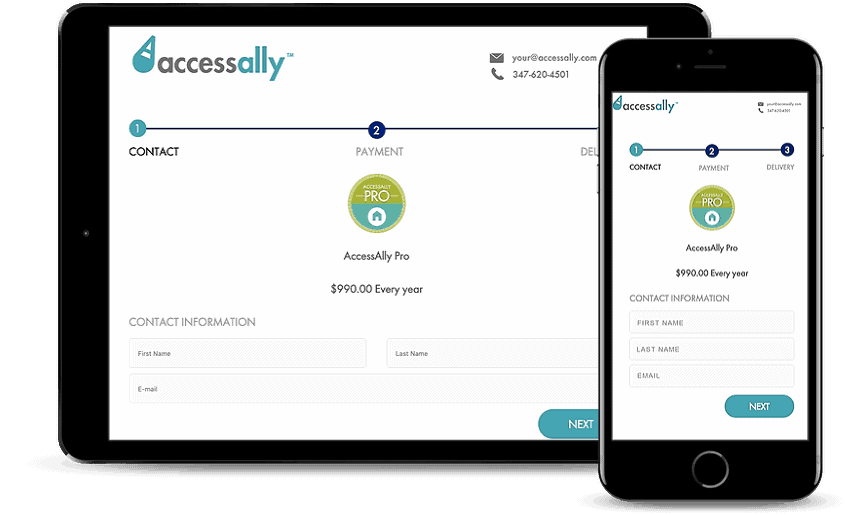

One-column checkout page templates have the highest conversion rates on mobile devices. When using two-column checkout page templates on desktop, ensure the order form reduces to one-column on mobile devices and the checkout process flows logically.
You want to make sure the customer is clear on what they are purchasing before you start requiring them to enter their personal details.
Reduce the need to scroll on mobile devices for customers as much as possible, but also ensure each step of your ordering process is easy to access and populate for your buyers.
4. Order Bumps
Order bumps are a great add-on to your checkout flow to increase revenue.
Sure, you might see it as a possible point of friction for your customers, because it is one more thing for them to consider as they submit their order.
The key is to make this offer a no-brainer for them. It must be relevant and an easy “yes” for them to add, with just a click of a button.
(If it can’t be explained with a picture and short description, save it for an upsell post-purchase.)
I highly recommend testing your conversion rates with and without the order bump to determine which offer yields the highest revenue.
5. Use Customer Testimonials To Increase Conversions
Use testimonials from past customers to help your potential buyers follow through with their order, especially on high-ticket items.
When a potential customer can relate to others who have also made the same purchase, they will be more willing to commit to the purchase.
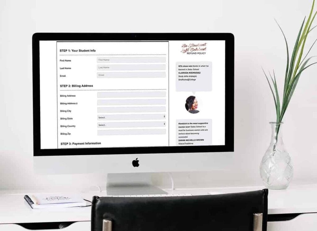

This technique creates a sense of belonging for the potential buyer, increases credibility for your products, and reassures the customer that they are making a good purchase decision.
Neil Patel, one of the most successful modern digital marketers, goes into more detail about the power of social proof in this article. He was able to increase conversions by 6.8% simply by including a testimonial on the checkout form.
6. Size Matters
The images of your products and the name of the item being purchased should be the most prominent part of your checkout form. The description and price should be smaller in comparison.
Psychologically, smaller font sizes used to display the price translates to a small or “low” price in the mind of a buyer. If the text is large (in relative comparison with the rest of the page design), they’ll automatically translate it to a “high” price.
In other words: you can help reduce the “whoah this is expensive” reaction simply by being strategic with how you set up your product and checkout pages.
7. Use Payment Plans To Get Buyers Off The Fence
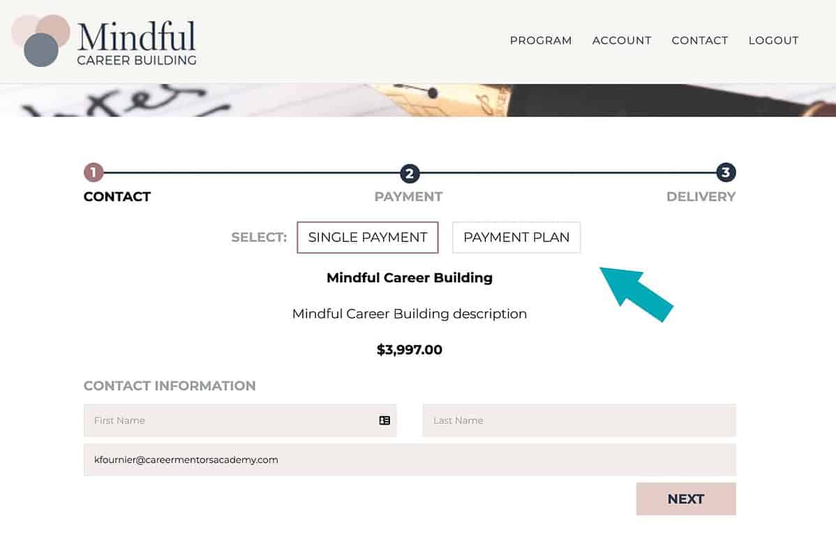

Sometimes, there’s an honest roadblock of “I can’t afford to pay this much right now” that prevents the buyer from completing the purchase. In these cases, you can use a toggle to display different payment plans available for your products and services on the checkout form itself.
I recommend defaulting to the full payment option when a user lands on your checkout page, but have the option to toggle to a payment plan to help make the decision easier for users who may be ready to buy, but the cost feels like a stretch to them.
(A note here: avoid offering too many payment options, or your potential customer will end up overwhelmed by the choices, and likely never complete their order.)
When kept simple, you’ll convert more leads into paying customers when you can offer a payment plan. In fact, according to SamCart, conversions increase over 17% when this is done well.
Your Potential Business Growth
With the added revenue from increased conversions you’ll be hitting your business milestones faster than you may have originally projected.
You can use the added revenue to invest in new technology to improve customer experience, hire new team members and invest more in your current ones, or take that vacation you’ve been putting off – you deserve it.
These small tweaks to maximize conversions in your checkout flow and checkout page templates could also be the increase you need to turn a failing business into a thriving one.
Which tips are you going to implement in your checkout flow right away? Leave a comment below to help hold yourself accountable.
Oh, and by the way – all of these checkout flow tips can be implemented with AccessAlly’s all-new checkout forms!
Learn more about AccessAlly’s great features by browsing through our LMS plugin or membership plugin software offering.
