When you sell multiple online courses or membership options … how do you encourage clients to invest in more than one?
More importantly: how do you do this without coming across as overwhelming or pushy?
Membership Site Dashboard: A Close Relative to the E-Commerce Shop
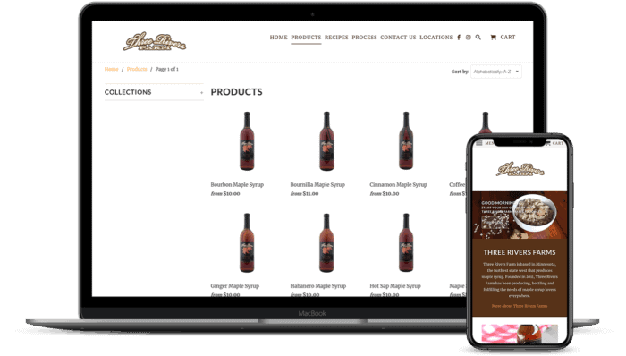
The first cue for your “shop” or dashboard design comes from what has become the standard ecommerce shop layout: columns of products with “click to read more” functionality.

This layout makes it easy for website visitors to scroll through and view your products, adding them to the shopping cart (or simply selecting a “buy now” option).
However, there’s a subtle difference between selling digital or physical products versus online courses/memberships:
Generally speaking, a client will not place multiple orders for an online course, the way that they might buy multiple notebooks.
This gives you a unique advantage in terms of what you can do design-wise to make your membership site dashboard more effective in generating revenue from upsells and cross-sells.
The Benefit of a Single Dashboard vs. Multiple Individual Sales Pages
There’s a reluctance with many online course builders when it comes to housing your membership, courses, and online challenges together in a single membership site (versus using multiple sales pages for current clients).
But the all-in-one website build can be an extremely powerful strategy towards online business growth: with a single membership site, you can identify how users interact with your material from login to logout.
It also lets you create a personalized experience for your users, guiding them through the material and identifying areas where they’re struggling and may need the resources contained within a separate course.
The Cross-selling Dashboard: A Design Shift For Increasing Sales
A member dashboard uses three key components to increase sales with current membership site users:
- Visually engaging course icons – essentially the “product thumbnail” you see in ecommerce sites
- Intuitive software that displays the icons differently based on whether the user has already purchased it or not
- The natural curiosity of your clients combined with and a psychological impulse to “collect it all”


Membership site built by Kimberly Gosney
Added bonus: when the user can log in and see at a glance everything you have to offer, it immediately puts them into the “shopping” mode… a definite good thing for you!
1. Visually Engaging Course Icons
Online course (or membership site) product thumbnails look a little different than “regular” product thumbnails, since there’s no quick photo to use.
This is where your graphic design skills – or a team member’s – is going to make the world of difference.
A bullet point list of 10 course titles is not going to garner nearly the amount of excitement as the icons in this example of Lindsay Preston’s course library:


2. Intuitive software that provides a dynamic view based on the user’s purchase history
So many client retention and marketing headaches can be eliminated when you’re able to personalize your client’s experience based on actions they’ve already taken.
This allows your membership site to dynamically show some course icons as “enabled”, and some as “disabled”… setting the stage for the next component.
3. Natural curiosity to “have it all”
Personal admission: when I get excited about something, I go into full-on “binge collector” mode.
Last week, I realized that I really liked painting with acrylics… so I spent the next few hours watching tutorials and spending over a hundred dollars buying the necessary supplies to get started (including a giant easel…).
Necessary?
Absolutely not.
But if you can capitalize on that feeling of excitement when your membership subscribers purchase their first course – the sales pitch becomes virtually unnecessary. All you have to do is showcase your offers, and the natural excitement (and curiosity) takes over.
What You’ll Need To Create Your Upselling Membership Website WordPress Dashboard
The tool list you need to support upsell processing is pretty short:
- A WordPress website
- The AccessAlly Pro membership plugin
- A tag-based CRM (see the current list of integrations)
Tutorial: How To Build An Interactive Membership Site Dashboard (Using AccessAlly)
Step 1: Install the AccessAlly WordPress Plugin for Your Membership Website Software
Real talk: learning how to build a membership website the right way takes many hours of learning your software, WordPress theme layouts, and testing each component carefully before you make it “live” to your clients.
But, in a nutshell, you’ll want to install AccessAlly on your WordPress site like any other plugin, then link it up so that it follows the automation rules you set up inside the AccessAlly course setup wizard.
Step 2: Assign Icons To Your Online Courses
When you build your courses inside AccessAlly’s Course Wizard, you can easily assign both the “enabled” and “disabled” version of your icon:
![]()
![]()
Step 3: Add Your Course Icons to Your Membership Site Dashboard Page


The shortcode simply adds the icon itself – any additional styling or formatting is totally up to you and your web designer!
Note that when you use the shortcode to add the course icons to a page, AccessAlly will automatically change the visible icon from enabled to disabled (or vice versa) depending on what permission tags your logged in users have.
…and that’s it!
Your interactive dashboard is all set up, and ready to help you upsell and cross sell your courses.


